Other Data Sources
So far in this course you’ve worked with data that we had already prepared for you. It turns out that there are many R packages and tools that you can use to get data from a variety of different sources. Below, we will provide a brief walkthrough of just a few of these resources.
Lahman
The Lahman Baseball Database is a popular resource created by Sean Lahman with historical data going back to 1871. Rather than having to access the database directly via complicated computing procedures, there is an R package we can install to access the data instead. The following code installs the package from the CRAN:
Next we load the package, and check out what datasets are available:
There is an incredible amount of data here going up through the 2021
season (it updates following the end of each season). As an example,
let’s access the Teams dataset, use a group_by operation to
calculate the number of strikeouts each year since 1871, and plot the
line over time:
Teams %>%
  group_by(yearID) %>%
  reframe(n_so = sum(SO, na.rm = TRUE)) %>%
  ggplot() +
  geom_line(aes(x = yearID, y = n_so)) +
  labs(x = "Year", y = "Number of strikeouts",
       title = "Total number of strikeouts in each baseball season since 1871",
       caption = "Data courtesy of Lahman") +
  theme_bw()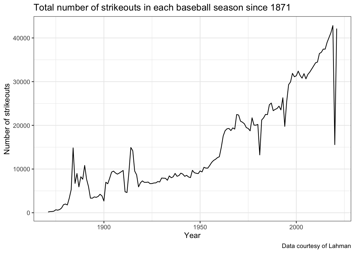
Note that rather than supplying the data as an argument to the
ggplot() function, we can start with a dataset, make
manipulations to it using pipes, and then pipe the new data into the
ggplot() function.
We can see the increasing trend over time, but note some of the outliers like 2020 (pandemic-shortened season) and 1994 (strike-shortened season). How could this display be improved to handle these outliers, as well as the other gameplay-related changes that have taken place in baseball?
nflfastR
The nflfastR
package gives R users the ability to scrape play-by-play data from
the NFL in real-time during games, also providing expected points and
win probability estimates. Here’s a good
tutorial on the main functions and data available within the
package. To get started, we install the package below. Let’s also
install the ggimage package, which will allow us to plot
the team logos for more intriguing visualizations.
Next, we load these packages.
Now we can use nflfastR to gather play-by-play data for
the 2021 season.
With this data, we can summarize the performance of all NFL teams using the expected points added (EPA) per game on offense and defense. EPA tells us how much value the team provided relative to an average baseline. The more positive the better the offensive performance. This means the more negative the value the defensive performance, so in the code chunk below we multiply the defensive values by -1 so it’s similar to offensive performance higher values meaning better performance. The following code uses this data to create offensive and defensive summaries that we will join together to plot:
offense_epa_21 <- pbp_2021 %>%
  filter(!is.na(posteam)) %>%
  group_by(posteam) %>%
  summarise(n_games = length(unique(game_id)), off_total_epa = sum(epa, na.rm = TRUE)) %>%
  mutate(off_epa_per_game = off_total_epa / n_games)

defense_epa_21 <- pbp_2021 %>%
  filter(!is.na(defteam)) %>%
  group_by(defteam) %>%
  summarise(n_games = length(unique(game_id)), def_total_epa = sum(epa, na.rm = TRUE)) %>%
  # This time multiply by -1, since negative values are better for defense:
  mutate(def_epa_per_game = -1 * def_total_epa / n_games)
Next, we join together the offensive and defensive EPA datasets, then
pass this new dataset into ggplot, where we make a plot of
offensive EPA per game vs. defensive EPA per game for all teams in the
2021 season.
# Create the data frame to be used for all of the charts:
offense_epa_21 %>%
  inner_join(defense_epa_21, by = c("posteam" = "defteam")) %>%
  left_join(teams_colors_logos, by = c("posteam" = "team_abbr")) %>%
  ggplot(aes(x = off_epa_per_game, y = def_epa_per_game)) +
  geom_image(aes(image = team_logo_espn), size = 0.05) +
  labs(x = "Offensive EPA per game",
       y = "Defensive EPA per game",
       caption = "Data accessed via nflfastR",
       title = "Offensive and defensive EPA per game for each team in the 2021 NFL season") +
  # Add reference lines at 0
  geom_hline(yintercept = 0, color = "red", linetype = "dashed") +
  geom_vline(xintercept = 0, color = "red", linetype = "dashed") +
  theme_bw()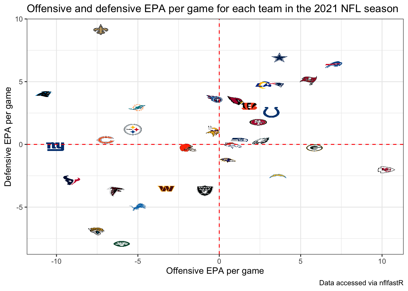
The top right displays the teams that excelled at both offense and defense, while the lower right shows teams that had the best offenses such as the Chiefs but performed poorly on defense. The lower left shows the worst overall teams, where the Jags, Jets, and Texans unsurprisingly stand out.
Installing GitHub Packages
While the vast majority of R packages you will commonly
use are able to be installed using install.packages()
because they are on the CRAN, there are a variety of popular
R packages for accessing sports data that are currently
only available through GitHub. In order to access these packages, we
first need to install them using a package called devtools.
The code below installs the devtools package:
The devtools package has a function,
install_github that we will use for installing the
remaining packages used below.
An important note to keep in mind is that most of these resources are largely still in development, so you may face challenges with installation and use.
baseballr
Created by Bill
Petti, the baseballr package has become a popular
resource for accessing baseball data from variety of resources, such
asFanGraphs and Baseball-Reference
directly into R. One of the best features of the
baseballr package is the functionality it provides us for
directly accessing the publicly available pitch-by-pitch and Statcast
data available from baseball-savant.
We first install the package using the devtools package
explained above, and then load its functions:
Using the baseballr package we can access all pitches
thrown to a hitter in the current season, giving us Statcast data like
exit velocity and launch angle. We first use the
playerid_lookup function to find the Statcast ID for
Yankees star (and potential AL MVP) Aaron Judge:
This will load up a look-up table with all identifiers joining
various sources together (it may take a couple minutes to run and don’t
worry about the warning messages). We find that Aaron Judge’s unique
mlbam_id is 592450. Using this id, we can grab all pitches
thrown to Judge in the current MLB season so far:
judge_statcast_data <- scrape_statcast_savant_batter(start_date = "2022-01-01",
                                                    end_date = "2022-12-31",
                                                    batterid = 592450)
This dataset contains many columns; for now we will look at the
relationship between the distance traveled of Aaron Judge’s batted balls
(denoted by type == "X") and the launch angle
(launch_angle) as well as the exit velocity
(launch_speed):
judge_statcast_data %>%
  filter(type == "X") %>%
  ggplot(aes(x = launch_speed, y = launch_angle,
             color = hit_distance_sc)) +
  geom_point() +
  scale_color_viridis_c(option = "A") +
  labs(x = "Exit velocity (MPH)", y = "Launch angle (degrees)",
       color = "Distance (feet)",
       title = "Aaron Judge's launch angle, exit velocity, and distance traveled",
       caption = "Data accessed via baseballr")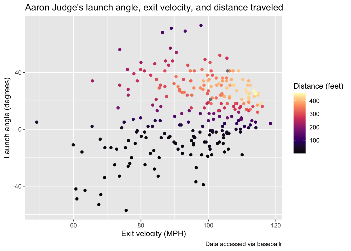
Note that this plot has been updated through July 15th of the 2022 season. Pitches thrown to Judge after this date will not appear on the above plot.
This is just a single example of the type of data available using
baseballr. See the package website for more data
acquisition functions. Additionally, the Exploring Baseball Data with
R website by Jim Albert is an incredible resource with a variety of
examples of learning R code all in the context of baseball data
analysis.
nbastatr
The nbastatr
package created by Alex Bresler is analogous to the
baseballr package as it provides many different functions
for accessing NBA data from a variety of websites. Again to be able to
use the package you need to install it from GitHub:
There will likely be several messages that appear when installing this package, please let us know if you encounter any strange issues. The code below demonstrates how to get all shot attempts by the 2022 NBA champions, the Golden State Warriors, in the past season using this package:
Using this shot data, we can view the all shot attempts by the Warriors throughout the season colored by whether or not they made the shot.
warriors_shots %>%
  ggplot(aes(x = locationX, y = locationY, color = isShotMade)) +
  geom_point(alpha = 0.5) +
  scale_color_manual(values = c("#FFC72C", "#1D428A")) +
  theme_bw() +
  labs(title = "Shot attempts by Golden State Warriors in 2021-22 NBA season",
       caption = "Data accessed via nbastatR")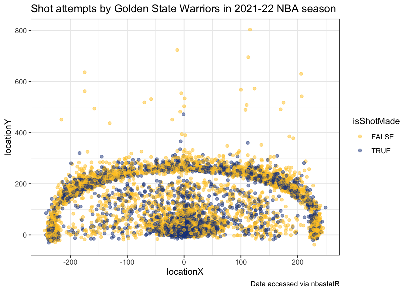
It’s apparent from this chart the effect of the three-point line of their shot selection.