Problem Set 6
Regression with Triathlon Data
Now that we’ve seen linear regression in R applied to MLB batting averages, let’s practice what we’ve learned in a context we haven’t worked with before. We will look at past results of the Ironman Triathlon and investigate relationships between racing splits and demographic variables. First let us download the Ironman Data and save it to our “data” folder.
Let’s read in the data and take a look at the variables.
## Rows: 22124 Columns: 389
## ── Column specification ────────────────────────────────────────────────────────
## Delimiter: ","
## chr  (103): Source Table, Name, Country, Gender, Division, Swim, Bike, Run, Overall, Division Ra...
## dbl  (102): BIB, Gender Rank, Overall Rank, Log Rank, Bike 28.2 mi Distance, Bike 50.4 mi Distan...
## time (184): Swim Total Split Time, Swim Total Race Time, T1, Bike 28.2 mi Split Time, Bike 28.2 ...
##
## ℹ Use `spec()` to retrieve the full column specification for this data.
## ℹ Specify the column types or set `show_col_types = FALSE` to quiet this message.
This is a large data set with hundreds of variables. Digging deeper, we can see that many of the variables seem to be repeated and many have data only in certain rows. This is common in historical racing results, so it’s important to determine which variables are most important for our analysis. In our case, this analysis will be looking at the results from the 2017 Florida race, and we will focus on the swim, bike, run, and overall finishing times as well as demographics including country, gender, and division.
Moreover, we note that the finishing times are actually
character-types in the form of ‘minutes:seconds’. Keeping these
variables in this form will pose problems as we are going to be
performing operations that require numeric data. So, we need to convert
these clock times into pure numbers. The best way to work with clock
times within the tidyverse framework is to use the
lubridate package. Within this package, we can parse the
times in the ‘minutes:seconds’ format using the ms()
function, and then convert the result to a numeric using the
period_to_seconds() function (the result will be a time in
seconds, so we can get this back to minutes by dividing by 60).
#install.packages("lubridate")
library(lubridate)
results_2017 <- data %>%
  filter(`Source Table` == '2017 - Florida') %>%
  select(Country, Gender, Division, Swim, Bike, Run, Overall) %>%
  drop_na() %>%
  mutate(Swim = period_to_seconds(ms(Swim))/60,
         Bike = period_to_seconds(ms(Bike))/60,
         Run = period_to_seconds(ms(Run))/60,
         Overall = period_to_seconds(ms(Overall))/60)
Simple Linear Regression
Now that we have our tidy dataset, let’s start looking at the relationships between each leg of the triathlon.
Create scatterplots of swim times vs. bike times, bike times vs. run times, and swim times vs. run times. Save them as variables titled ‘plot.swim_bike’, etc.
To compare the relationships between these three variables, we can plot all three plots in the same window, rather than having to scroll through each one individually. To do so, we use the
ggarrangefunction within theggpubrpackage. As arguments of the function, we select our three plots and can specify the number of rows and columns to be displayed.
#install.packages("ggpubr")
library(ggpubr)
ggarrange(plot.swim_bike, plot.bike_run, plot.swim_run, nrow = 2, ncol = 2)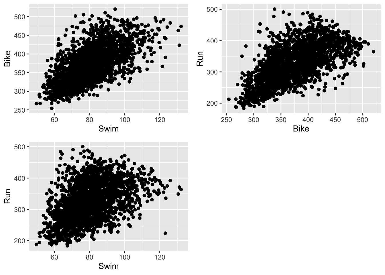
- Can you visually compare these associations by looking at the scatterplots? Which legs of the race seem to be more highly correlated?
- Another way to display three continuous variables at once is by creating a scatterplot for two of the variables and then coloring the points by the values of the third variable. Try doing so with different combinations of our variables to create plots like the one below.
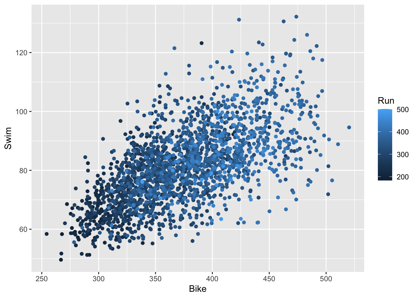
- From this one, we can see that the racers with faster swim and bike times tended to have faster run times; however, the specific relationship between Swim vs. Run and Bike vs. Run is less clear than in the individual scatter plots.
- To numerically evaluate these relationships, compute the correlation between each of the variables (you should compute 3 different correlations).
## [1] 0.6379414## [1] 0.642096## [1] 0.4433809- Now, let’s fit our linear model. Right now, we are doing simple linear regression, which involves one response variable and one predictor variable. So, let’s start by running a regression with Swim as our predictor and Bike as our response.
- We obtain the following slope and intercept for this regression.
## (Intercept)        Swim
## 179.129651 2.395295- We also want to add the regression line to our plot. Use
predict()to generate predictions based on the model, andmutate()to add them to your data. Then, usegeom_line()to add this predicted line to the plot. You may need to increase the size to increase the visibility of the line.
results_2017 <- results_2017 %>%
  mutate(swim_bike_pred = predict(lm.swim_bike))

ggplot(results_2017) +
  geom_point(aes(Swim, Bike)) +
  geom_line(aes(x = Swim, y = swim_bike_pred), color = 'lightcoral', size = 1.5)
## Warning: Using `size` aesthetic for lines was deprecated in ggplot2 3.4.0.
## ℹ Please use `linewidth` instead.
## This warning is displayed once every 8 hours.
## Call `lifecycle::last_lifecycle_warnings()` to see where this warning was
## generated.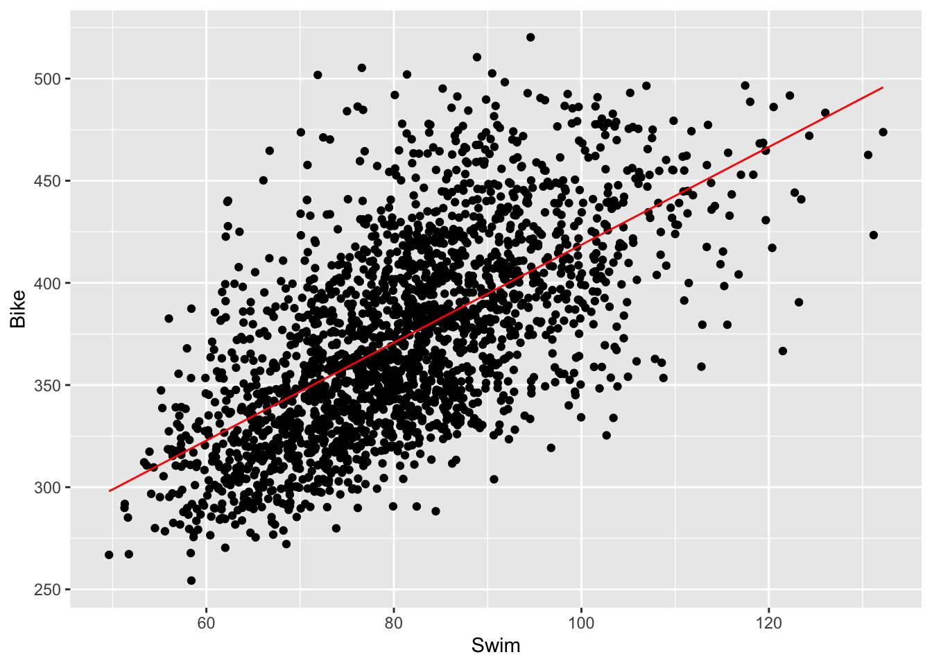
- Repeat steps 5 and 6 for the two other combinations of the three race legs. Note that since we’re only investigating associations between variables (as opposed to causal relations) it doesn’t really matter which variable we choose to be our predictor and response; the resulting plots will be the same, except with flipped axes. If, instead, we were trying to determine causality, we would put the independent/predictor variable on the x-axis and the dependent/response variable on the y-axis.
Going beyond simple linear regression
In the following two lectures we will be looking at other forms of regression, namely logistic regression and multiple regression. Whereas simple linear regression deals with two continuous variables that share a linear relationship, we can extend our ideas of regression to more than two variables as well as variables that are binary or discrete in scale, or share nonlinear relationships.
Nonlinear Regression
What if we had reason to believe the association between the finishing times of each leg of the triathlon was quadratic, rather than linear? For instance, imagine higher times on the run leg were associated with slightly higher times on the bike leg, but not linearly higher? This could be possible if we had reason to believe that the top racers in the Ironman are good on the bike but separate themselves with really fast run times, while the slower racers are equally slow on the bike and on the run.
- First let’s start by running simple linear regression on Run vs. Bike, because it’s best to start with simple models before moving onto more complex models. Similarly as before, we want to draw this regression line on our plot. To do this, we create a grid with discretized Run values as the x values, and the predicted values from our linear model as the y values. Then, we draw a line through these points, which is our regression line.
## (Intercept)         Run
## 205.7610166   0.5147168
results_2017 <- results_2017 %>%
mutate(run_bike_pred = predict(lm.run_bike))
ggplot(results_2017) +
geom_point(aes(Run, Bike)) +
geom_line(aes(x = Run, y = run_bike_pred), color = 'lightcoral')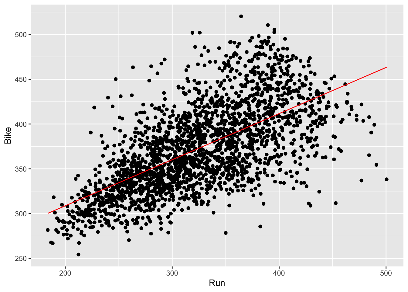
- Now, we can run the quadratic regression. To include the quadratic relation into our linear model, we will add a quadratic term as an additional predictor variable (which, in this case, is Run).
##  (Intercept)          Run     I(Run^2)
## 26.222478107 1.649746436 -0.001732342- To draw this regression line on our plot, we can take the grid of values used on our simple linear regression in step 1, and add another column with the predicted values from our new quadratic model. This new column contains the new y values of the regression line.
results_2017 <- results_2017 %>%
  mutate(run_bike_pred2 = predict(lm.run_bike2))
ggplot(results_2017) +
  geom_point(aes(Run, Bike)) +
  geom_line(aes(x = Run, y = run_bike_pred), color = 'lightcoral', size = 1.5) +
  geom_line(aes(x = Run, y = run_bike_pred2), color = 'lightblue4', size = 1.5)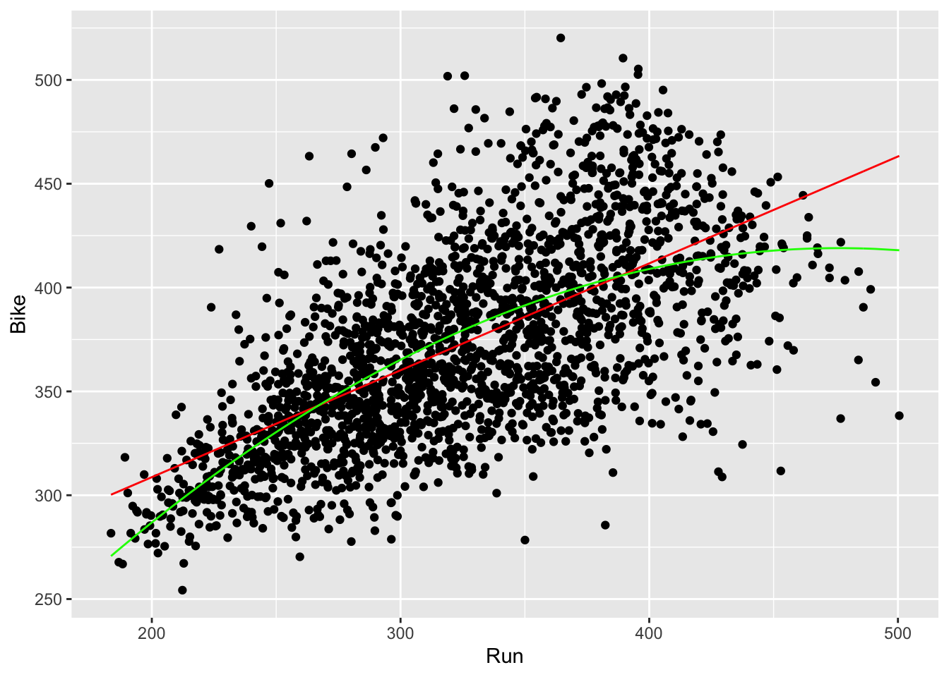
- Now, we can determine if our quadratic model fits the data better than our linear model. To do this, we can compute the RMSEs of both models (as discussed in Lecture 4) and see which is lower.
reframe(results_2017,
          rmse.run_bike = sqrt(mean(lm.run_bike$residuals^2)),
          rmse.run_bike2 = sqrt(mean(lm.run_bike2$residuals^2)))
## # A tibble: 1 × 2
## rmse.run_bike rmse.run_bike2
## <dbl> <dbl>
## 1 37.266 36.524- In fact, it does appear that the quadratic model appears to fit our data better!
Regression with multiple predictors
Let’s start with our Run vs. Bike linear model again; what if we now want to add a gender effect? This would be the case if we think that the bike times differ depending on a racer’s gender.
- We have already run the linear model without the gender effect. Now let’s add the gender effect in.
lm.run_bike_gender <- lm(data = results_2017, formula = Bike ~ Run + Gender)
lm.run_bike_gender$coefficients
## (Intercept) Run GenderMale
## 229.316963 0.502562 -26.143851- To interpret these results, we can say that for every increase in one minute of run times, bike times increase by about half a minute. Moreover, being a male is associated with bike time that is on average 26 minutes lower than the alternative (being a female).
- Now, let’s plot our regression. Note that there will be two separate regression lines: one for the association between running and biking for males, and one for the association between running and biking for females. Also note that since we now technically have two predictor variables to go on our x-axis, we need to create a new grid that spans the values of the Run variable as well as the Gender variable
results_2017 <- results_2017 %>%
  mutate(run_bike_gender = predict(lm.run_bike_gender))
ggplot(results_2017) +
  geom_point(aes(Run, Bike)) +
  geom_line(aes(x = Run, y = run_bike_pred), color = 'lightcoral', size = 1.5) +
  geom_line(aes(x = Run, y = run_bike_gender, col = Gender), size = 1.5) +
  scale_color_manual(values = c(Female="lightblue4", Male="darkseagreen3"))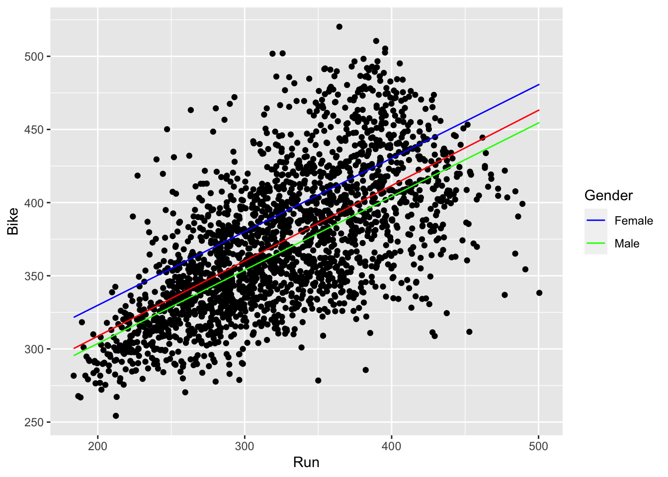
- We can now clearly see that females have slower bike times than males. Note that the red line in the middle corresponds to our simple linear regression without the gender effect.
- We can probably guess that the model with the gender effect fits the data better than our simple linear regression (i.e. knowing the gender of a racer and their run time allows us to better predict their bike time). But let’s verify this computationally.
reframe(results_2017,
          rmse.run_bike = sqrt(mean(lm.run_bike$residuals^2)),
          rmse.run_bike_gender = sqrt(mean(lm.run_bike_gender$residuals^2)))
## # A tibble: 1 × 2
## rmse.run_bike rmse.run_bike_gender
## <dbl> <dbl>
## 1 37.266 35.511- Indeed! We will have lower residuals on average by making predictions from our gender-included model than with our simple linear regression.