Lecture 3: Visualizations with categorical data and grouped operations
We’re going to pick up right where we left off in Lecture 2 by loading the
nba_shooting dataset we created using the
filter and mutate functions.
We’re interested in the rate and efficiency of three-point attempts
over time. To start, let’s make simple histograms for
three_point_fg_rate = TPA / FGA and TPP
following what we learned in Lecture
2.
nba_shooting %>%
  ggplot(aes(x = three_point_fg_rate)) +
  geom_histogram(binwidth = 0.05) +
  # label!
  labs(x = "Three-point shot rate = TPA / FGA",
       y = "Count",
       title = "Distribution of three-pointer shot rate")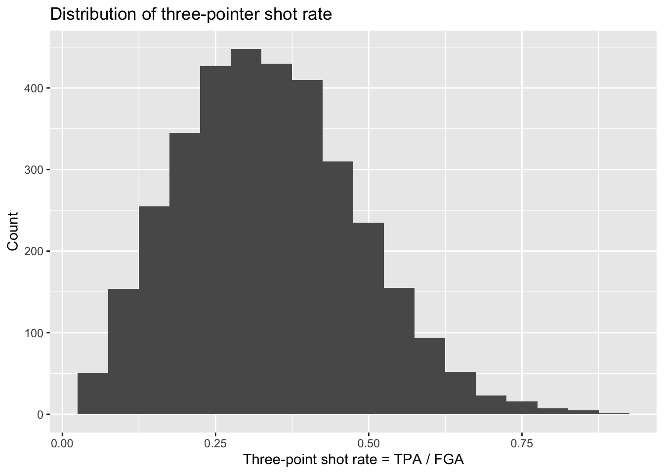
nba_shooting %>%
  ggplot(aes(x = TPP)) +
  geom_histogram(bins = 30) +
  # label!
  labs(x = "Three-point shot proportion = TPM / TPA",
       y = "Count",
       title = "Distribution of three-point shot proportion")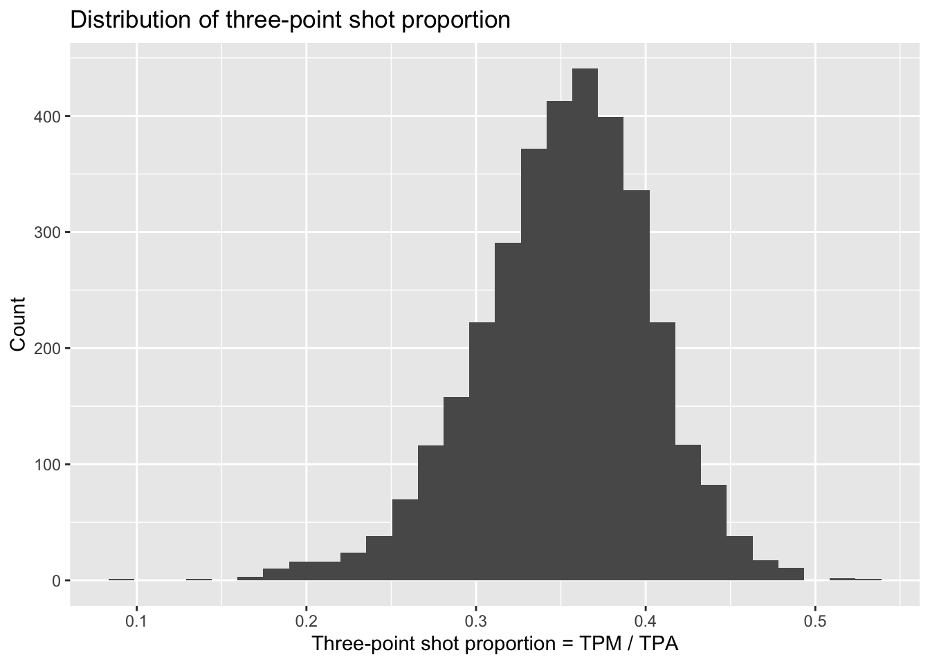
Next let’s make a scatterplot showing the relationship between the rate at which players attempt three point shots and the proportion at which they make them:
nba_shooting %>%
  ggplot(aes(x = three_point_fg_rate, y = TPP)) +
  geom_point(alpha = 0.25) +
  labs(x = "Three-point shot rate = TPA / FGA",
       y = "Three-point shot proportion = TPM / TPA",
       title = "Relationship between three point shot rate and efficiency")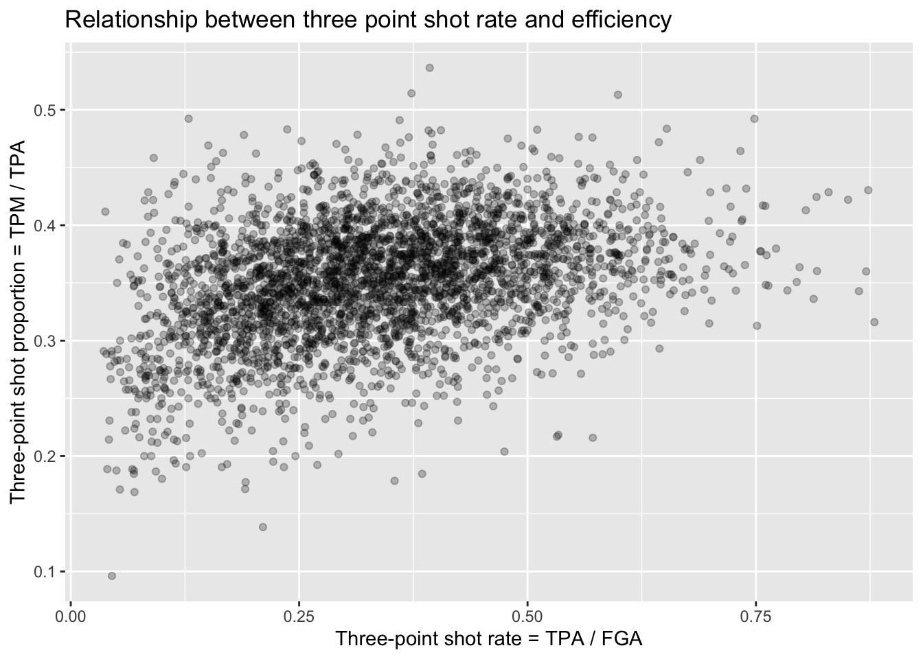
Unsurprisingly, for the most part we see a random scattering of points. But we can see that players who attempt a minimal proportion of three-point shots for their field goal attempts also have typically low values for their three point shot efficiency. You can expect players that can make three-pointers more often to then attempt more and more three-pointers - but, as the plot shows, they will reach a point where their advantage diminishes.
Plotting categorical data
The style of shooting in the NBA has been evolving over the past
decade, with teams attempting more and more three-point shots than ever
before. We can look into this trend ourselves using the
nba_shooting dataset we constructed. Something such as the
season/year could be considered like a continuous variable. For
instance, we could create a scatterplot with the SEASON
variable on the x-axis and each of the variables of interest on the
y-axis, such as:
nba_shooting %>%
  ggplot(aes(x = SEASON, y = three_point_fg_rate)) +
  geom_point(alpha = 0.25) +
  labs(x = "Season",
       y = "Three-point shot rate = TPA / FGA",
       title = "Distribution of three point shot rate each year")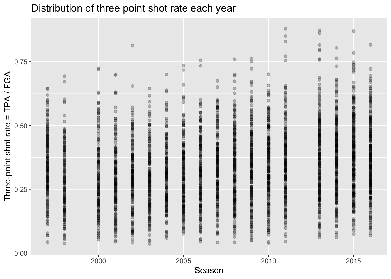
It is hard to see any real differences between the years this way.
Instead, we can treat the season as a categorical
variable to then more appropriately compare the distributions
between each year. To do so, we are going to create a new variable in
our dataset called season_factor which is simply a new
version of the SEASON variable but is converted to a
special type of data in R known as a “factor”. We won’t
cover the details, but “factors” are essentially categorical variables
with an order to them. By default, when we create
season_factor using the as.factor() function,
the natural chronological order is used.
Now with this variable, prior to comparing distributions between the different seasons, we will create a barchart to compare the number of players we have in each season that met our criteria from Lecture 2.
This can be done using geom_bar, and all we have to
specify is the categorical variable to be displayed along the x-axis -
ggplot will count the number of each player and display it
for us just like geom_histogram.
nba_shooting %>%
  ggplot(aes(x = season_factor)) +
  geom_bar() +
  labs(x = "Season", y = "Count",
       title = "Number of players in each season meeting TPA and FGA cutoffs",
       subtitle = "Excluding lockout seasons 1999 and 2012")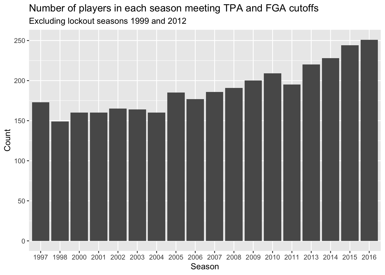
What shouldn’t come as a surprise is that we’re seeing more and more players in more recent years. This makes sense since more players are shooting three-pointers more frequently now.
Comparing distributions
Now that we have a categorical version of the season to use for plotting, we can proceed to compare the distributions of the three-point stats in a variety of ways.
Naturally you can make multiple histograms to compare the distributions of several different categories with simple extensions of code you are already familiar with. This can be done in several different ways.
Facets
We can use facets to create histograms for each different
season. Facets allow you to separate graphs by category. We do not need
to do anything different from our above code for creating histograms
except we only need to add a facet layer to our graph. The
first argument of facet_wrap is the column of our dataset
that contains the category information. Note that we need a tilde
(~) in front of season_factor. The second
argument of facet_wrap specifies the number of rows for
which to display the graphs.
nba_shooting %>%
  ggplot(aes(x = three_point_fg_rate)) +
  geom_histogram(binwidth = 0.05) +
  labs(x = "Three-point shot rate = TPA / FGA",
       y = "Count",
       title = "Distribution of 3PT shot rate by season") +
  facet_wrap(~season_factor, nrow = 3)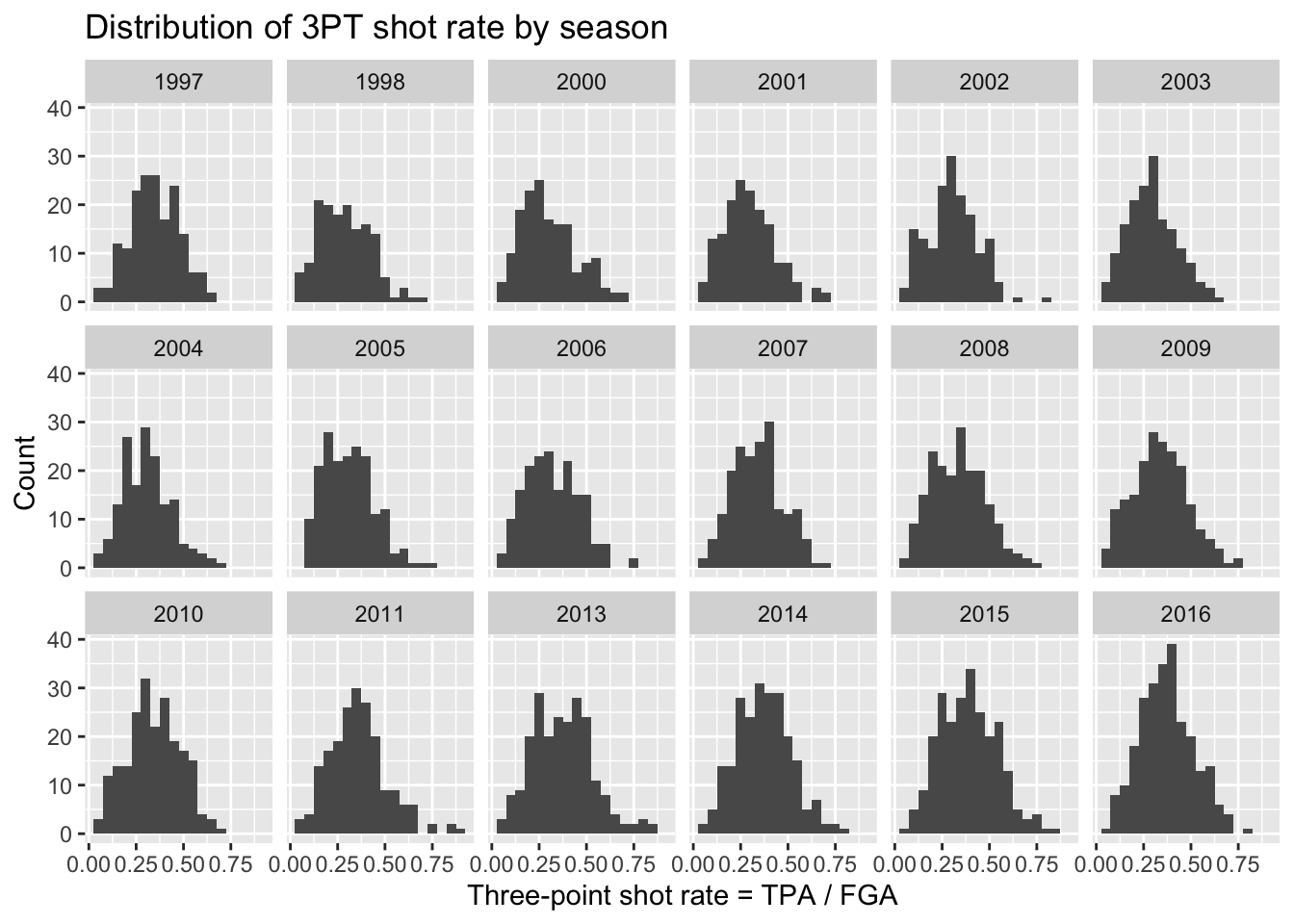
Although we can now see a histogram of three-point shot rate for each separate season, it’s a little hard to make comparisons across all the years.
Colors
We can also proceed to create multiple histograms using colors
instead of facets, by just adding the fill = season_factor
line to the aes function. NOTE: it’s
important to remember the difference between fill and
color. In this case, fill actually changes the
literal fill of the bars while color changes the
line. This differs from geom_point and is important to keep
in mind when making plots.
nba_shooting %>%
  ggplot(aes(x = three_point_fg_rate, fill = season_factor)) +
  geom_histogram(binwidth = 0.05) +
  labs(x = "Three-point shot rate = TPA / FGA",
       y = "Count",
       fill = "Season",
title = "Distribution of 3PT shot rate by season") 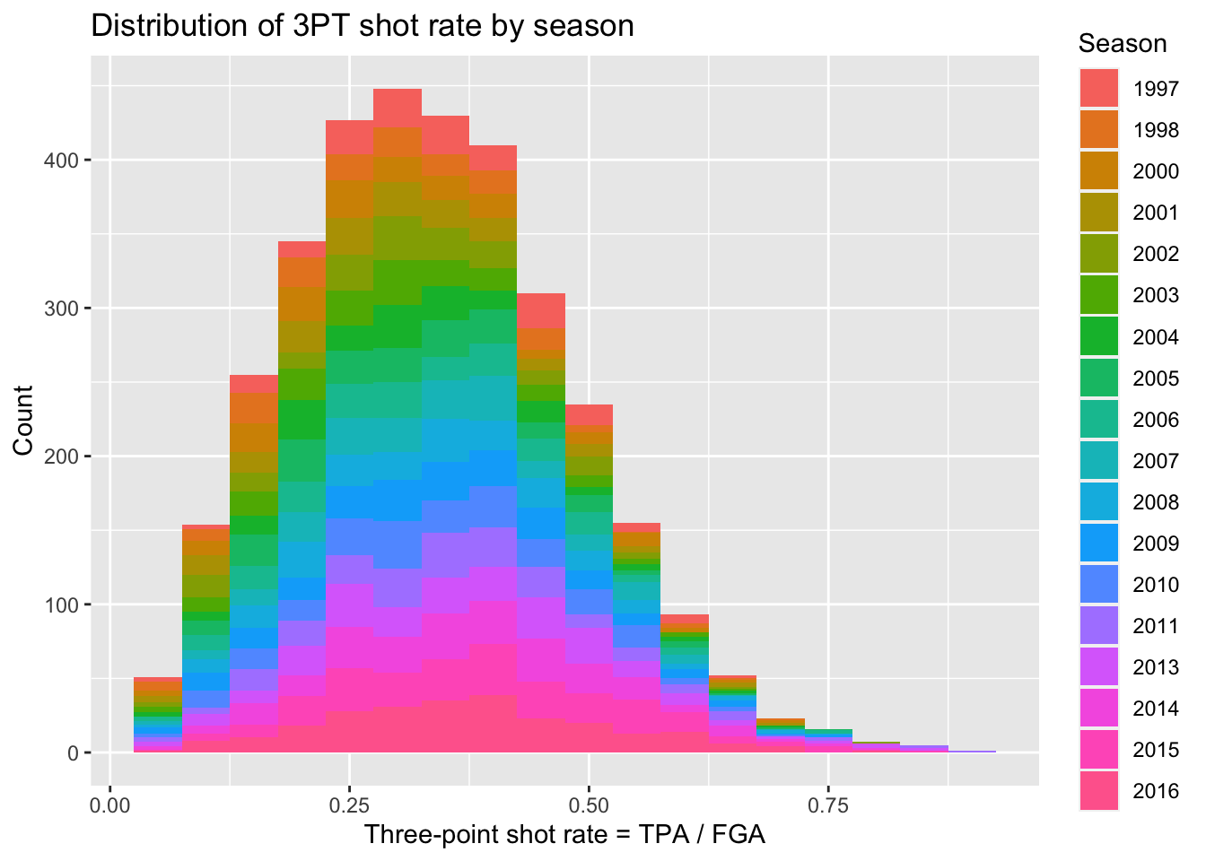
Well that’s a weird looking plot! This is because by default the
multiple histograms will be stacked on top of one another. We can
instead change the position of the
geom_histogram call to be equal to “identity” rather than
the default which is “stacked”. When doing this we’ll have several
histograms overlaid on top of each other, so it’s important to change
the alpha to be a lower value.
nba_shooting %>%
  ggplot(aes(x = three_point_fg_rate, fill = season_factor)) +
  geom_histogram(binwidth = 0.05, position = "identity",
                 alpha = 0.1) +
  labs(x = "Three-point shot rate = TPA / FGA",
       y = "Count",
       fill = "Season",
title = "Distribution of 3PT shot rate by season") 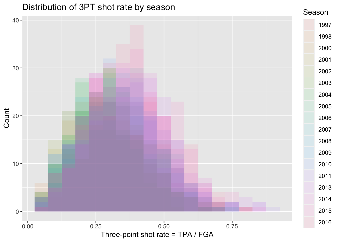
Overall this is still a rather difficult figure to digest. Instead, we should make figures that take advantage of the natural ordering implied by the season along an axis while displaying various comparisons of the distributions.
Boxplots
By far the simplest way to compare distributions across many levels
of a categorical variable is with boxplots. Side-by-side boxplots can be
generated easily using geom_boxplot. Now we specify the
categorical variable we want mapped to the x-axis
(season_factor) and then the variable we want mapped to the
y-axis.
nba_shooting %>%
  ggplot(aes(x = season_factor, y = three_point_fg_rate)) +
  geom_boxplot() +
  labs(x = "Season",
       y = "Three-point shot rate = TPA / FGA",
title = "Comparison of 3PT shot rate for each season with boxplots") 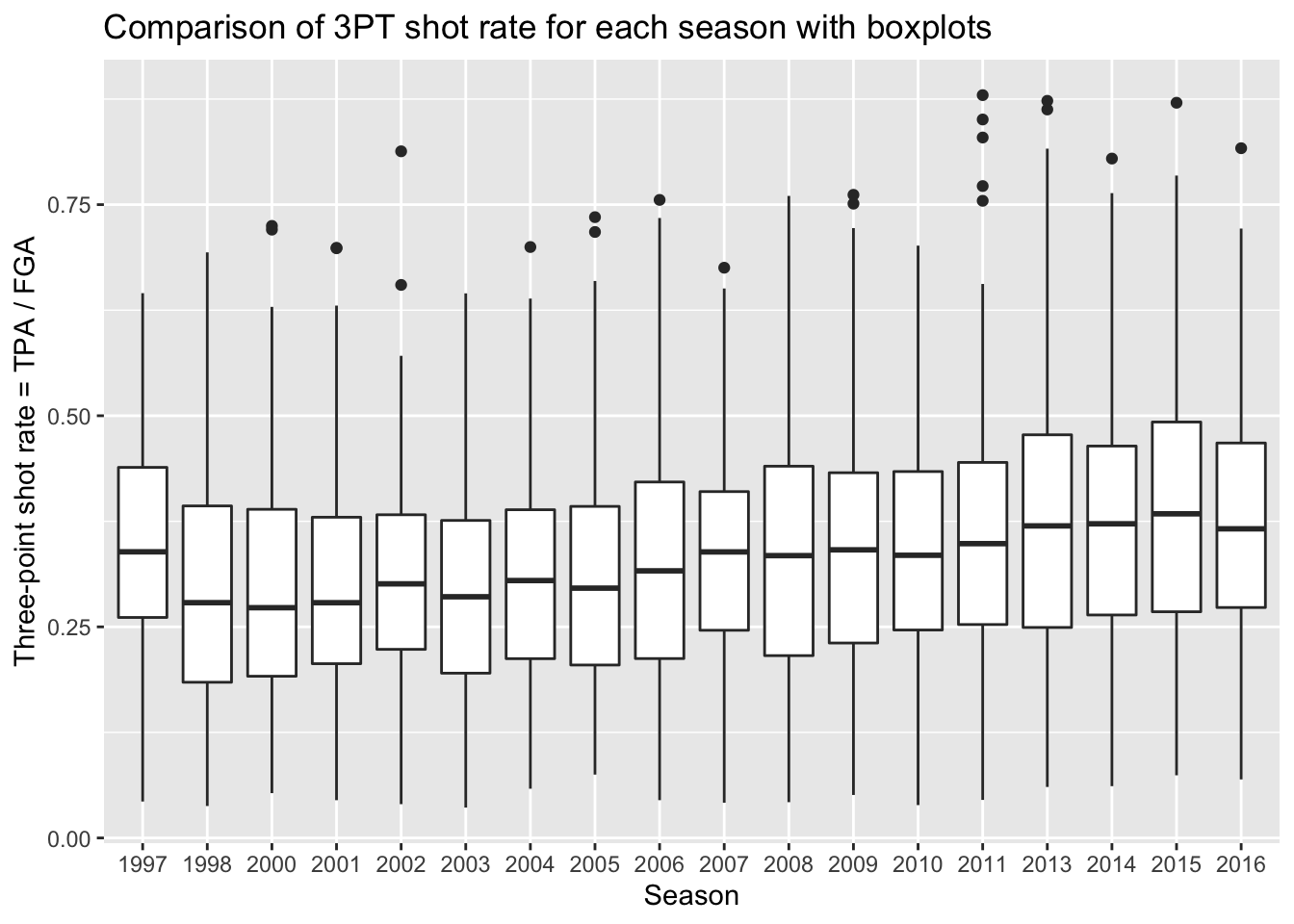
Remember, boxplots are displaying summary statistics (median, min, max, and percentiles) which allows us to easily see an increase in the median three-point shot rate over time. But boxplots are extremely limited visualizations! All they provide are summary statistics - think of all the information we observed in histograms that are lost in boxplots! There is no way of knowing if we’re looking at distributions with multiple modes!
Violin plots
A much more informative plot than only a boxplot, is a violin
plot. Violin plots display the density curves giving us the
general shape of a distribution. And of course, there’s a
geom for that as well called… geom_violin!
nba_shooting %>%
  ggplot(aes(x = season_factor, y = three_point_fg_rate)) +
  geom_violin() +
  labs(x = "Season",
       y = "Three-point shot rate = TPA / FGA",
title = "Comparison of 3PT shot rate for each season with violin plots") 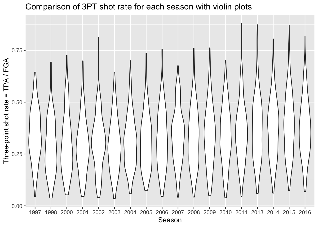
This gives us a sense of the distributions in each season, and any
sort of subtle differences over time. What’s missing from this plot is
the key points provided by boxplots to show the increasing rate of three
point attempts. Because we are using ggplot, we can easily
add the boxplot layer on top of the violin plots to get the best of both
visualizations! We just specify a small width for our
boxplots so that they don’t take up too much space and fit inside the
violin plots.
nba_shooting %>%
  ggplot(aes(x = season_factor, y = three_point_fg_rate)) +
  geom_violin() +
  geom_boxplot(width = 0.2) +
  labs(x = "Season",
       y = "Three-point shot rate = TPA / FGA",
title = "Comparison of 3PT shot rate for each season with violin and boxplots") 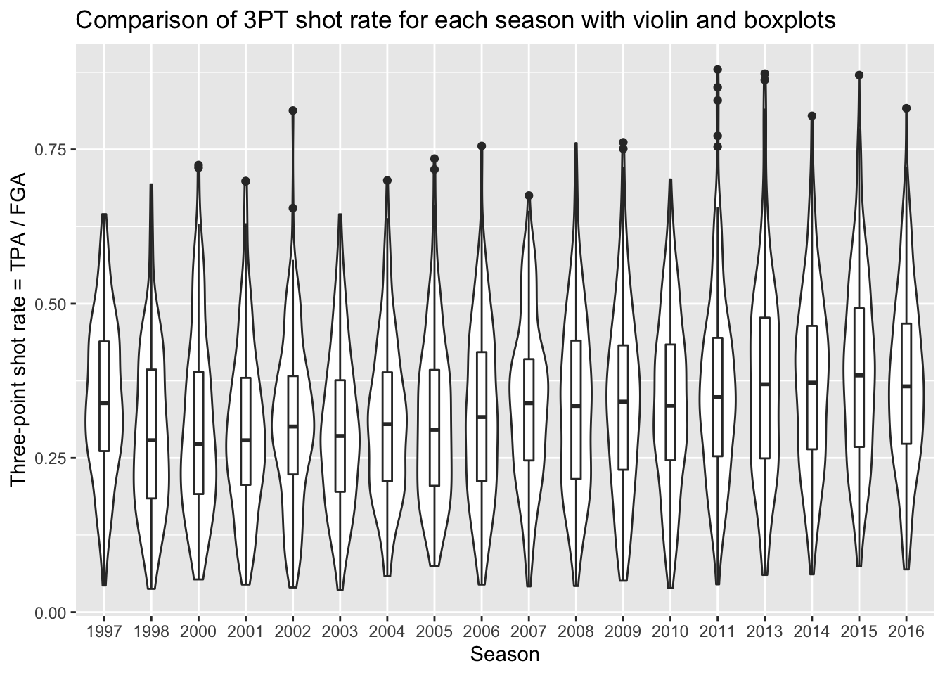
Ridgeplots
Many people often find violin plots hard to look at, and this has led
to the development of another curve-based approach known as
ridge plots. Ridge plots are often used to view the
change in distributions over time, especially with a large number of
years considered such as the example here. In order to make ridge plots,
we need to install an additional package: ggridges.
With this package installed, we can now access it and use what appears
to be a slightly different mapping then boxplots and violin plots:
# install.packages("ggridges")
library(ggridges)
nba_shooting %>%
  ggplot(aes(x = three_point_fg_rate, y = season_factor)) +
  geom_density_ridges() +
  labs(y = "Season",
       x = "Three-point shot rate = TPA / FGA",
       title = "Comparison of 3PT shot rate for each season with ridges")
## Picking joint bandwidth of 0.0435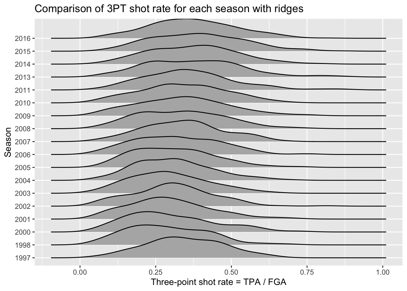
The code above is similar to geom_histogram but now maps
the y-axis to a variable for separating the distributions. The idea is
it eliminates the redundancy in the symmetry of violin plots by just
displaying one side of the curve. We can see a slight shift taking place
over time to higher 3PT shot rates.
Beeswarm plots
Beeswarm plots are the final type of plot we’ll
consider for comparing distributions. Again in order to create beeswarm
plots, we need to install an additional package: ggbeeswarm.
Beeswarm plots display the distributions for each category by
plotting all of the individual data points with the
placement resembling the histogram and density curve shape.
# install.packages("ggbeeswarm")
library(ggbeeswarm)
nba_shooting %>%
  ggplot(aes(x = season_factor, y = three_point_fg_rate)) +
  geom_quasirandom(size = 0.5) +
  labs(x = "Season",
       y = "Three-point shot rate = TPA / FGA",
title = "Comparison of 3PT shot rate for each season with beeswarms") 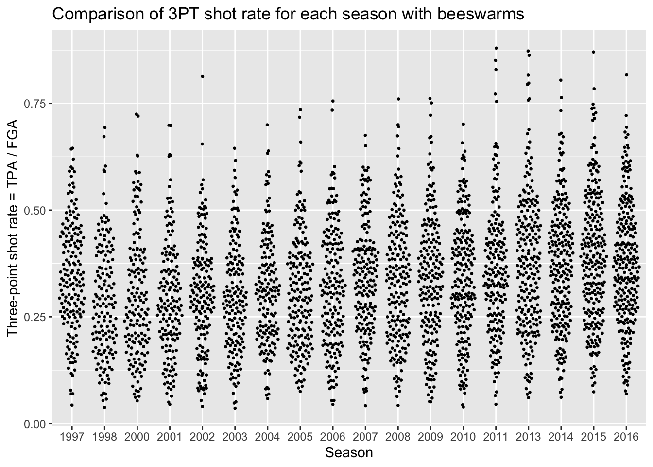
Group by and summarize
Very often in a data analysis, instead of performing a calculation on the entire data set, you’ll want to first split the data into smaller subsets, apply the same calculation on every subset, and then combine the results from each subset. For example, in order to calculate the average three-point shot rate for each season, we need to split our dataset based on the season, compute the average three-point shot rate, and combine back into a single dataset.
We can easily implement this “split-apply-combine” paradigm using the
function group_by(). Let’s now modify the
nba_shooting data so that the years belonging to the same
season are grouped together.
When we print out nba_shooting now, we notice an extra
line that tells us the grouping variable. Now when we pass this
tbl on to subsequent calculations, these calculations will
be done on each group.
We can now summarize each season using another tidyverse
function called… reframe()! This convenient function will
compute summary statistics that we specify with respect to the groups
from group_by(). For instance, we can compute the average
three-point shot rate for each season in the following way:
## # A tibble: 18 × 2
##    season_factor ave_tp_shot_rate
##    <fct>                    <dbl>
##  1 1997                   0.34532
##  2 1998                   0.28801
##  3 2000                   0.30031
##  4 2001                   0.29487
##  5 2002                   0.30531
##  6 2003                   0.29496
##  7 2004                   0.30909
##  8 2005                   0.31025
##  9 2006                   0.31941
## 10 2007                   0.34112
## 11 2008                   0.33445
## 12 2009                   0.33936
## 13 2010                   0.34117
## 14 2011                   0.36058
## 15 2013                   0.37512
## 16 2014                   0.37304
## 17 2015                   0.38993
## 18 2016                   0.37272
The following functions are quite useful for summarizing several aspects of the distribution of the variables in our dataset:
- Center:
mean(),median() - Spread:
sd(),IQR() - Range:
min(),max() - Count:
n(),n_distinct()
Now we’ll make a dataset that provides us with both the mean and
standard deviation of three-point shot rate within each
year, storing it as nba_shooting_summary:
nba_shooting_summary <- nba_shooting %>%
  reframe(ave_tp_shot_rate = mean(three_point_fg_rate),
            sd_tp_shot_rate = sd(three_point_fg_rate))
With this dataset, we are now going to create a plot that shows the
average three-point shot rate each year, along with error
bars to represent plus-or-minus one standard deviation. We’ll
use geom_point to plot the average, then display an
interval with geom_errorbar. Now we’re going to do
something a little different for this plot, since we’re using multiple
geoms we will set the aes separately rather
than in the ggplot call like before for the settings that
are unique to geom_errorbar. Both geom_point
and and geom_errorbar will share the same x
axis though so that will be assigned in the ggplot
line:
nba_shooting_summary %>%
  ggplot(aes(x = season_factor)) +
  geom_point(aes(y = ave_tp_shot_rate)) +
  geom_errorbar(aes(ymin = ave_tp_shot_rate - sd_tp_shot_rate,
                    ymax = ave_tp_shot_rate + sd_tp_shot_rate)) +
  labs(x = "Season",
       y = "Three point shot rate = TPA / FGA",
       title = "Average three point shot rate with +/- 1 standard deviation")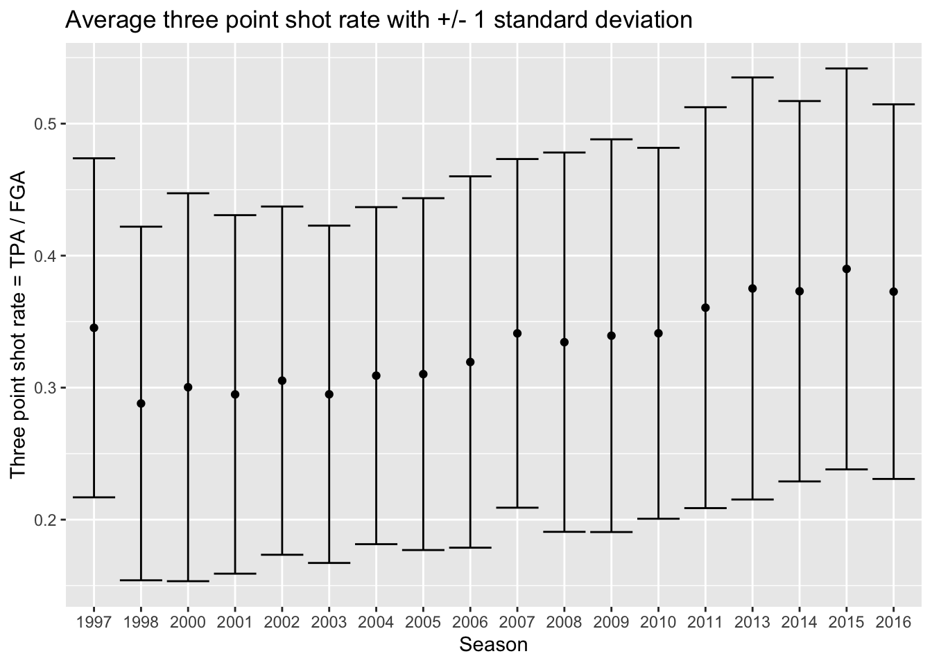
And one of the best parts of using ggplot is that we can
take this code, and add it to our previous code - such
as the violin plots or beeswarm plots. All we have to do is specify the
dataset to use for each geom separately now, rather than
piping the whole dataset into the operation:
# Start with blank canvas:
ggplot() +
  # Now add the violin plot layer:
  geom_violin(data = nba_shooting,
              aes(x = season_factor, y = three_point_fg_rate)) +
  # Next the layers for the average and error bars:
  geom_point(data = nba_shooting_summary,
             aes(x = season_factor, y = ave_tp_shot_rate),
             # Let's make this red on top:
             color = "red") +
  geom_errorbar(data = nba_shooting_summary,
                aes(x = season_factor,
                    ymin = ave_tp_shot_rate - sd_tp_shot_rate,
                    ymax = ave_tp_shot_rate + sd_tp_shot_rate),
                color = "red") +
  labs(x = "Season",
       y = "Three-point shot rate = TPA / FGA",
       title = "Distribution of 3PT shot rate for each season",
       subtitle = "Red points indicate average for each year with +/- 1 standard deviation")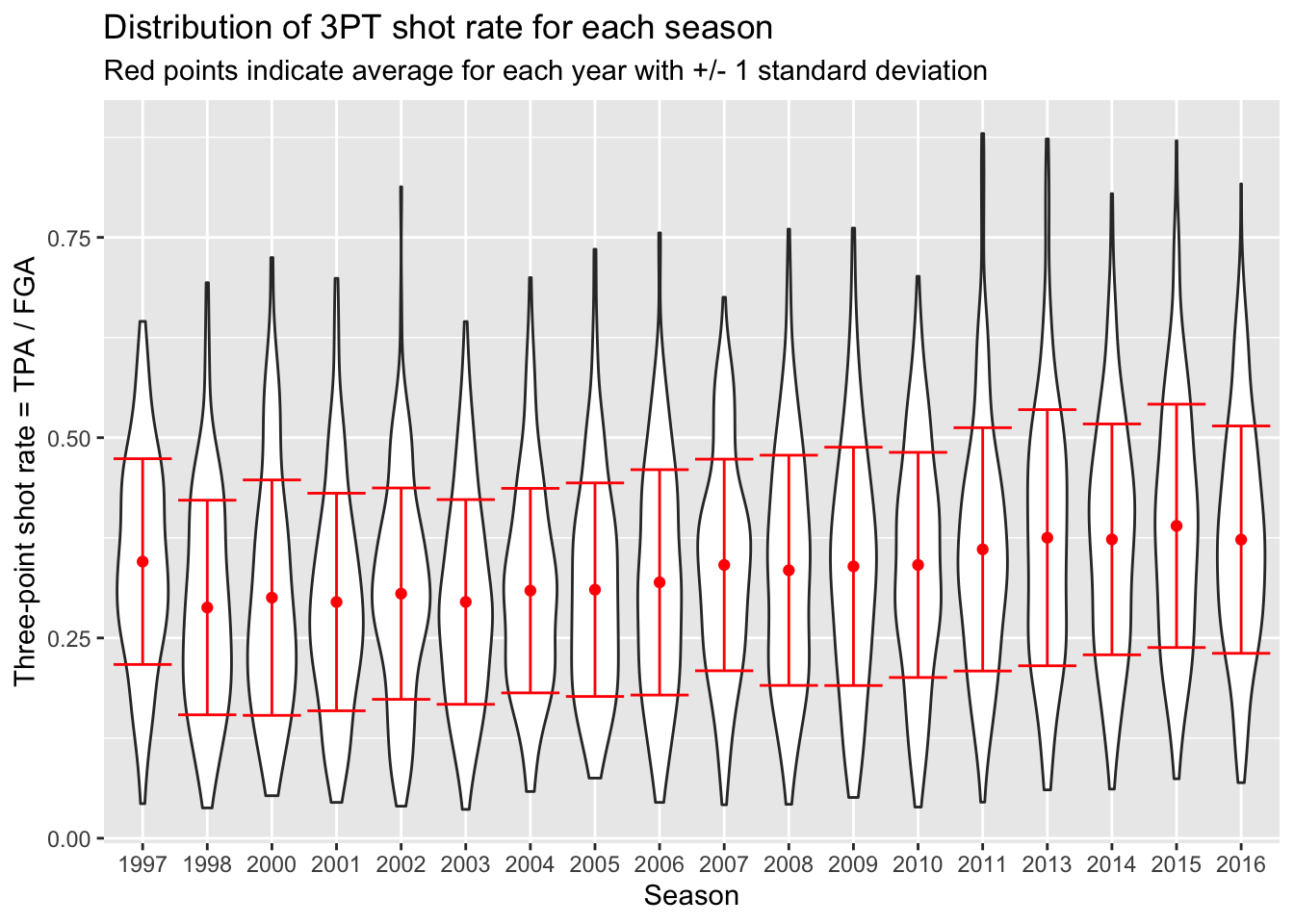
# Start with blank canvas:
ggplot() +
  # Now add the beeswarm plot layer:
  geom_quasirandom(data = nba_shooting,
                   aes(x = season_factor, y = three_point_fg_rate),
                   size = 0.5) +
  # Next the layers for the average and error bars:
  geom_point(data = nba_shooting_summary,
             aes(x = season_factor, y = ave_tp_shot_rate),
             # Let's make this red on top:
             color = "red") +
  geom_errorbar(data = nba_shooting_summary,
                aes(x = season_factor,
                    ymin = ave_tp_shot_rate - sd_tp_shot_rate,
                    ymax = ave_tp_shot_rate + sd_tp_shot_rate),
                color = "red") +
  labs(x = "Season",
       y = "Three-point shot rate = TPA / FGA",
       title = "Distribution of 3PT shot rate for each season",
       subtitle = "Red points indicate average for each year with +/- 1 standard deviation")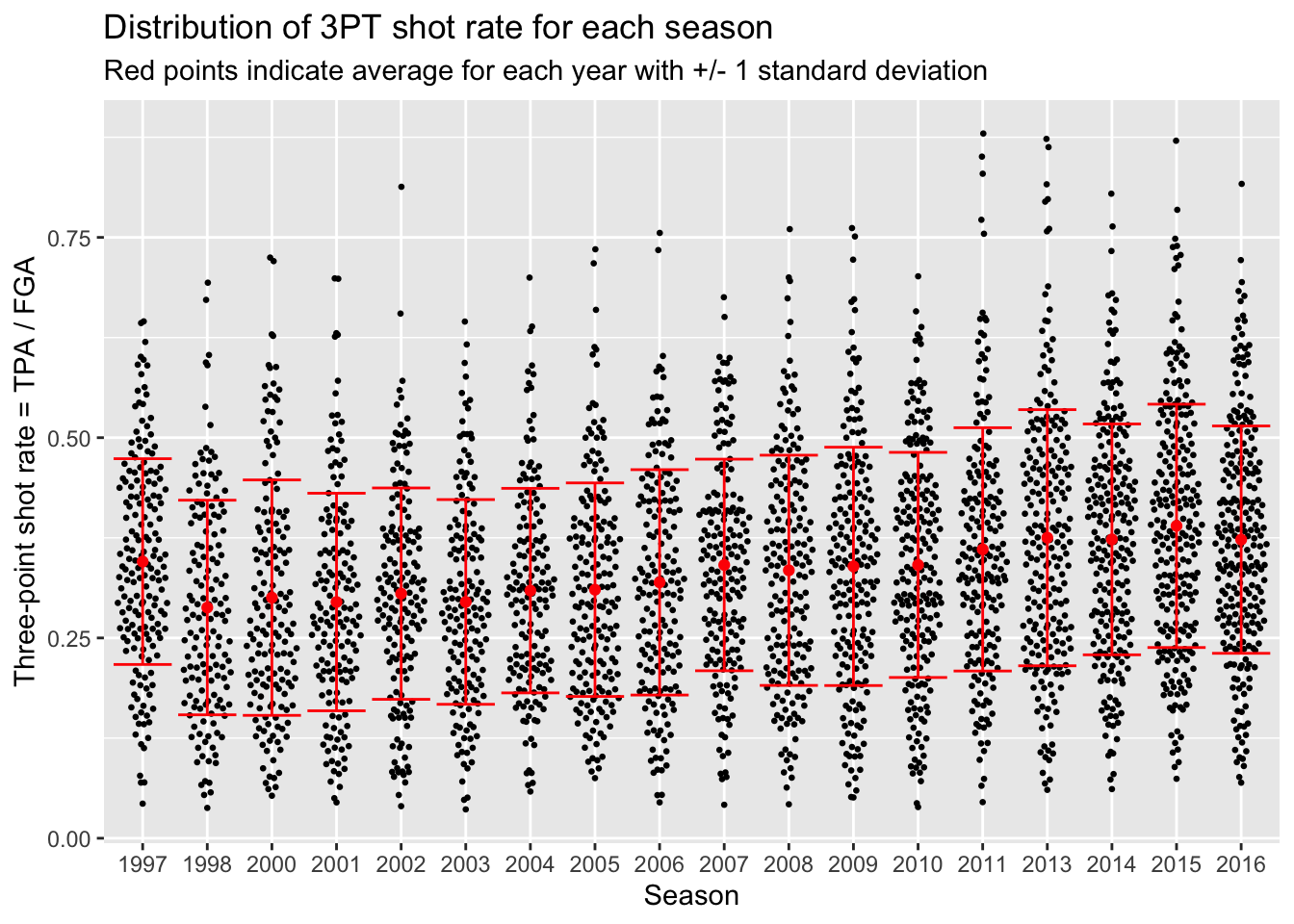
You probably noticed that the first season in the dataset (labeled 1997 but corresponds to 1996-1997) has a higher three-point shot rate than other earlier years. As it turns out, this was the last year of a closer three-point line! The NBA experimented with a closer three-point line for three years before moving it back to the original location in the 1997-1998 season (labeled 1998 in our dataset).
We can now ungroup our dataset since we’re done with
this operation:
To end today’s lecture, we could have used the following code instead as a shortcut for displaying the averages and standard deviation bars.
nba_shooting %>%
  ggplot(aes(x = season_factor, y = three_point_fg_rate)) +
  geom_violin() +
  # Now add a summary layer:
  stat_summary(fun.data = "mean_sdl",
               fun.args = list(mult = 1),
               color = "red") +
  labs(x = "Season",
       y = "Three-point shot rate = TPA / FGA",
       title = "Distribution of 3PT shot rate for each season",
       subtitle = "Red points indicate average for each year with +/- 1 standard deviation")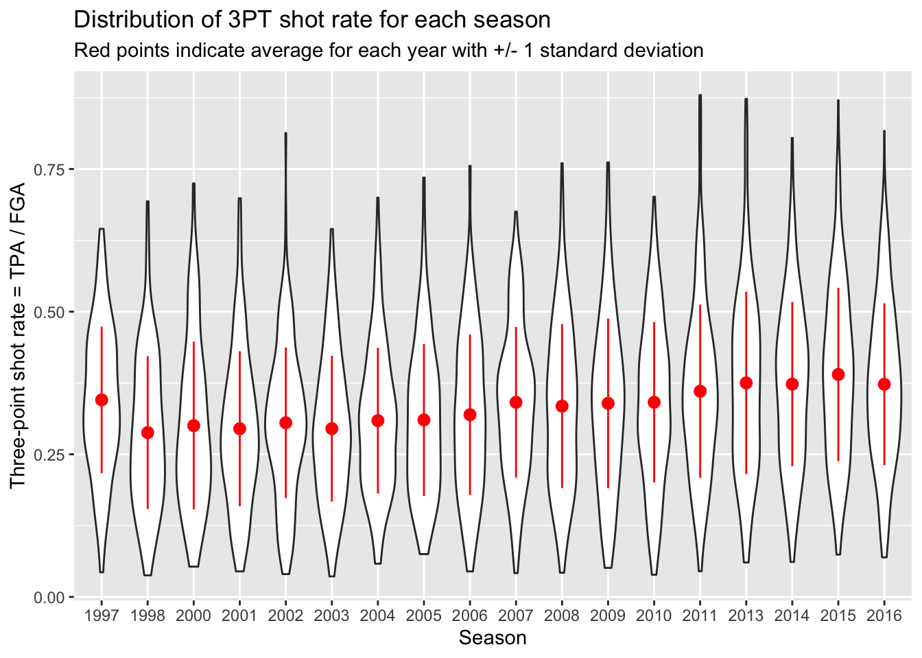
This is a completely different style of plotting than you have seen
before, but it is extremely convenient since we don’t need to create a
separate dataset to display summaries of the data. The
fun.data part is asking for a type of summary, where here
we are using the mean and standard deviation summary indicated by
mean_sdl. Then the fun.args is taking the
multiplier for the standard deviation interval.
Now spend time going through this lecture and repeat the same type of analysis for TPP in Problem Set 3.