Lecture 4: Defining custom functions and standardizing data
Introduction
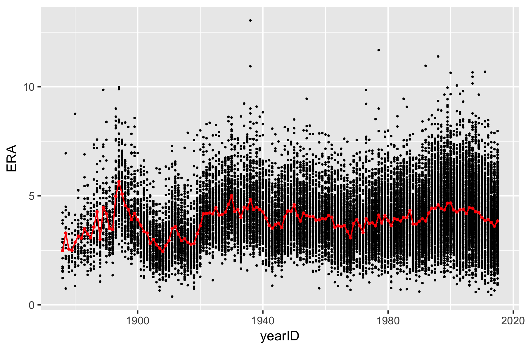
On day 3 of the morning lectures (Lecture 6), you see a graph of Earned Run Average (ERA) against year, along with a line connecting the average ERA in each year.
In order to reproduce this image, we will work with the Lahman Baseball
Database. As it turns out, there is an R package that includes the
entire database (up until the 2018 season). We will load that into R
along with the tidyverse packages when we begin our
analysis.
The Lahman Baseball Database
As mentioned above, we will use data from a baseball data maintained by Sean Lahman. This database contains pitching, hitting, and fielding statistics from Major League Baseball from 1871 to 2016. The data is available as an R package, which we will need to install and load. To install the package, we need to run the following in our console.
Once the package is installed, we can load it into R along with the tidyverse packages:
As we know, many packages not only contain new functions, but also
new datasets. Whenever we load a package, the datasets that are part of
the package get implicitly loaded into the background. To see which
datasets come with the Lahman package, we use the data()
function.
This will open up a new window with all of the names of the datasets
contained in the Lahman package. Today, we will specifically be focusing
on the dataset called Pitching, which contains season-level
statistics on all pitchers going all the way back to 1871. Let’s load
this dataset as a tibble (which is easier to read than the default
data.frame) called pitching.
## # A tibble: 51,368 × 30
##    playerID  yearID stint teamID lgID      W     L     G    GS    CG   SHO    SV IPouts     H    ER
##    <chr>      <int> <int> <fct>  <fct> <int> <int> <int> <int> <int> <int> <int>  <int> <int> <int>
##  1 aardsda01   2004     1 SFN    NL        1     0    11     0     0     0     0     32    20     8
##  2 aardsda01   2006     1 CHN    NL        3     0    45     0     0     0     0    159    41    24
##  3 aardsda01   2007     1 CHA    AL        2     1    25     0     0     0     0     97    39    23
##  4 aardsda01   2008     1 BOS    AL        4     2    47     0     0     0     0    146    49    30
##  5 aardsda01   2009     1 SEA    AL        3     6    73     0     0     0    38    214    49    20
##  6 aardsda01   2010     1 SEA    AL        0     6    53     0     0     0    31    149    33    19
##  7 aardsda01   2012     1 NYA    AL        0     0     1     0     0     0     0      3     1     1
##  8 aardsda01   2013     1 NYN    NL        2     2    43     0     0     0     0    119    39    19
##  9 aardsda01   2015     1 ATL    NL        1     1    33     0     0     0     0     92    25    16
## 10 aasedo01    1977     1 BOS    AL        6     2    13    13     4     2     0    277    85    32
## # ℹ 51,358 more rows
## # ℹ 15 more variables: HR <int>, BB <int>, SO <int>, BAOpp <dbl>, ERA <dbl>, IBB <int>, WP <int>,
## #   HBP <int>, BK <int>, BFP <int>, GF <int>, R <int>, SH <int>, SF <int>, GIDP <int>
There are tons of rows and columns in the dataset. For this exercise, we will only want to focus on ERA and also focus only on those pitchers who have pitched at least 150 innings. Unfortunately, the Lahman pitching dataset does not contain the number of innings pitched (IP). Instead, it has a column called “IPouts”, which is the number of outs pitched and whose formula is \(\text{IPOuts} = 3 \times \text{IP}.\)
Using the pipe and the dplyr verbs we learned in Lecture 2, we will create a new dataset called
pitching (we make it all lowercase to differentiate from
the original Lahman Pitching dataset), then add the “IP”
column, filter the data to include only all players who pitched at least
150 innings and played in either the AL or the NL, and select only the
columns corresponding to the player, year, team, league, innings
pitched, and ERA.
pitching <- pitching %>%
  mutate(IP = IPouts/3) %>%
  filter(lgID %in% c('AL', 'NL') & IP >= 150) %>%
  select(playerID, yearID, teamID, lgID, IP, ERA)
pitching
## # A tibble: 9,688 × 6
## playerID yearID teamID lgID IP ERA
## <chr> <int> <fct> <fct> <dbl> <dbl>
## 1 aasedo01 1978 CAL AL 178.67 4.03
## 2 aasedo01 1979 CAL AL 185.33 4.81
## 3 aasedo01 1980 CAL AL 175 4.06
## 4 abbeybe01 1892 WAS NL 195.67 3.45
## 5 abbeybe01 1896 BRO NL 164.33 5.15
## 6 abbotgl01 1977 SEA AL 204.33 4.45
## 7 abbotgl01 1978 SEA AL 155.33 5.27
## 8 abbotgl01 1980 SEA AL 215 4.1
## 9 abbotji01 1989 CAL AL 181.33 3.92
## 10 abbotji01 1990 CAL AL 211.67 4.51
## # ℹ 9,678 more rowsIMPORTANT: Before reading any further, make sure you and your team understand completely what is happening in the code above.
Now that we have ERA for all pitchers eligible for our analysis, we can plot the ERAs by year.
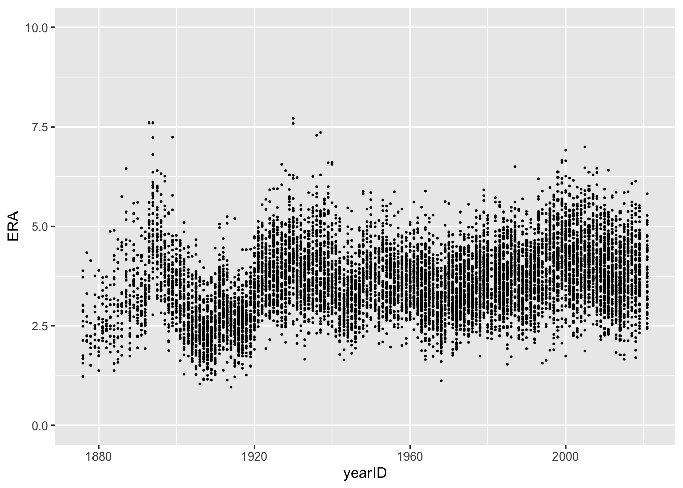
Looking at the plot, it appears that some of the pitchers from the
first few decades of baseball had the lowest ERA. Using
arrange(), we can see which pitcher had the best season
according to ERA.
## # A tibble: 9,688 × 6
##    playerID  yearID teamID lgID      IP   ERA
##    <chr>      <int> <fct>  <fct>  <dbl> <dbl>
##  1 leonadu01   1914 BOS    AL    224.67  0.96
##  2 brownmo01   1906 CHN    NL    277.33  1.04
##  3 gibsobo01   1968 SLN    NL    304.67  1.12
##  4 johnswa01   1913 WS1    AL    346     1.14
##  5 mathech01   1909 NY1    NL    275.33  1.14
##  6 pfiesja01   1907 CHN    NL    195     1.15
##  7 jossad01    1908 CLE    AL    325     1.16
##  8 lundgca01   1907 CHN    NL    207     1.17
##  9 alexape01   1915 PHI    NL    376.33  1.22
## 10 bradlge01   1876 SL3    NL    573     1.23
## # ℹ 9,678 more rows
It would appear that the best pitching season of all time was Dutch Leonard’s 1914 season with the Red Sox. The next best was Mordecai Brown’s 1906 season with the Cubs. How much better was Leonard’s 0.96 ERA than Brown’s 1.04 ERA?
To answer this, we can transform ERA to standardized units using the
mutate() function. There is a minor complication: there is
not a built-in function for standardizing a variable in R! Luckily for
us, R allows us to define our own functions like so:
standardize <- function(x){
  mu <- mean(x, na.rm = TRUE)
  sigma <- sd(x, na.rm = TRUE)
  return( (x - mu)/sigma )
}
For now, don’t worry too much about the syntax or the
na.rm = TRUE bits; we will discuss them in more depth
later. Armed with our standardize() function, we can add a
column called zERA_all which transforms ERA to the standardized
scale.
## # A tibble: 9,688 × 7
##    playerID  yearID teamID lgID      IP   ERA zERA_all
##    <chr>      <int> <fct>  <fct>  <dbl> <dbl>    <dbl>
##  1 leonadu01   1914 BOS    AL    224.67  0.96  -3.0115
##  2 brownmo01   1906 CHN    NL    277.33  1.04  -2.9207
##  3 gibsobo01   1968 SLN    NL    304.67  1.12  -2.8299
##  4 johnswa01   1913 WS1    AL    346     1.14  -2.8072
##  5 mathech01   1909 NY1    NL    275.33  1.14  -2.8072
##  6 pfiesja01   1907 CHN    NL    195     1.15  -2.7958
##  7 jossad01    1908 CLE    AL    325     1.16  -2.7845
##  8 lundgca01   1907 CHN    NL    207     1.17  -2.7731
##  9 alexape01   1915 PHI    NL    376.33  1.22  -2.7164
## 10 bradlge01   1876 SL3    NL    573     1.23  -2.7050
## # ℹ 9,678 more rows
Now we see that Leonard’s 0.96 ERA was about 3 standard deviations below the overall mean of qualified pitchers, while Brown’s was about 2.91 standard deviations below the mean. On the other hand, the ostensibly worst pitching season was Philadelphia’s own Les Sweetland in 1930. Incidentally enough, Sweetland started that season with a three-hit shutout! Check out this ESPN blog post about the 1930’s Phillies pitching staff.
Of course, you might argue that comparing the raw ERAs across the various years is somewhat unfair. After all, the game as it was played in 1914 is very different to the one played today! As such, it may be more appropriate to standardize all of the ERAs within each season separately. To do this, we will have to compute the mean and standard deviation of ERAs within each season.
Grouped calculations
Very often in a data analysis, instead of performing a calculation on the entire data set, you’ll want to first split the data into smaller subsets, apply the same calculation on every subset, and then combine the results from each subset. For example, in order to replicate the figure above from Prof. Wyner’s lecture, we need to split our pitching dataset based on the year, compute the average ERA within each year, and then combine these into a single tibble.
One strength of dplyr is the ease with which you can follow this
“split-apply-combine” paradigm using the function
group_by(). We can use this in concert with the pipe as
follows:
When we print out pitching now, we notice an extra line
that tells us the grouping variable. Now when we pass this dataset on to
subsequent calculations, these calculations will be done on each
group.
We can now summarize each season using another tidyverse
function called… reframe()! This convenient function will
compute summary statistics that we specify with respect to the groups
from group_by(). For instance, we can compute the average
ERA in each year in the following way:
## # A tibble: 147 × 2
##    yearID ave_ERA
##     <int>   <dbl>
##  1   1876  2.4246
##  2   1877  2.7843
##  3   1878  2.3229
##  4   1879  2.5708
##  5   1880  2.3317
##  6   1881  2.7586
##  7   1882  2.7607
##  8   1883  2.79
##  9   1884  3.0405
## 10   1885  2.8732
## # ℹ 137 more rows
The following functions are quite useful for summarizing several aspects of the distribution of the variables in our dataset:
- Center:
mean(),median() - Spread:
sd(),IQR() - Range:
min(),max() - Count:
n(),n_distinct()
We’ll now create a dataset, pitching_summary, that
contains the mean and standard deviation of ERA within each
year:
One of the most commonly used functions, n(), returns
counts and is especially useful when used on a grouped dataset We can,
for instance, count the number of pitchers in our dataset within each
year using n().
## # A tibble: 147 × 2
##    yearID count
##     <int> <int>
##  1   1877     7
##  2   1878     7
##  3   1880    12
##  4   1876    13
##  5   1879    13
##  6   1883    13
##  7   1881    14
##  8   1882    14
##  9   1884    19
## 10   1885    19
## # ℹ 137 more rows
Or equivalently, we can use the count function:
## # A tibble: 147 × 2
## # Groups:   yearID [147]
##    yearID     n
##     <int> <int>
##  1   1877     7
##  2   1878     7
##  3   1880    12
##  4   1876    13
##  5   1879    13
##  6   1883    13
##  7   1881    14
##  8   1882    14
##  9   1884    19
## 10   1885    19
## # ℹ 137 more rows
What’s the difference between the two approaches above?
Exercise: Describe, in words, what the following code does.
Once we add a grouping to our dataset, it also changes the way
mutate() operates on it. We can now standardize each
pitcher’s ERA within each year and store that result in a column called
z_era_year.
## # A tibble: 9,688 × 8
## # Groups:   yearID [147]
##    playerID  yearID teamID lgID      IP   ERA zERA_all z_era_year
##    <chr>      <int> <fct>  <fct>  <dbl> <dbl>    <dbl>      <dbl>
##  1 leonadu01   1914 BOS    AL    224.67  0.96  -3.0115    -3.4806
##  2 martipe02   2000 BOS    AL    217     1.74  -2.1261    -3.1600
##  3 maddugr01   1995 ATL    NL    209.67  1.63  -2.2510    -3.0197
##  4 luquedo01   1923 CIN    NL    322     1.93  -1.9104    -2.8833
##  5 martipe02   1999 BOS    AL    213.33  2.07  -1.7515    -2.8549
##  6 brownke01   1996 FLO    NL    233     1.89  -1.9558    -2.8244
##  7 eichhma01   1986 TOR    AL    157     1.72  -2.1488    -2.8135
##  8 maddugr01   1994 ATL    NL    202     1.56  -2.3304    -2.7881
##  9 piercbi02   1955 CHA    AL    205.67  1.97  -1.8650    -2.7718
## 10 hubbeca01   1933 NY1    NL    308.67  1.66  -2.2169    -2.7658
## # ℹ 9,678 more rows
Ungrouping and grouping on multiple variables
As we just saw, when we add a grouping to a dataset, it affects how
verbs like reframe() and mutate() operate on
our data. It is sometimes the case that we wish to remove the grouping
and let these verbs (and others) operate on the entire dataset again. To
remove the grouping, we have to use the ungroup() function.
Remember, as with the other tidyverse verbs we’ve learned,
we need to store the result if we want the dataset to remain
ungrouped!
To verify that we’ve indeed removed the grouping, let’s re-run the code from above to compute the mean and standard deviation of ERA.
## # A tibble: 1 × 2
##     mean      sd
##    <dbl>   <dbl>
## 1 3.6130 0.88096
Up to this point, we have only grouped on a single variable. It is
sometimes desirable to group on multiple variables at once. For
instance, we may want to standardize ERA not only within each year but
also within each leauge (AL and NL). That is, we may want to standardize
each individual pitcher’s ERA using only the data from the other
pitchers who pitched in the same league and in the same season. We also
add a column called count_year_lg to record the number of
pitchers included in each year-league combination.
pitching <- pitching %>%
  group_by(yearID, lgID) %>%
  mutate(z_era_year_lg = standardize(ERA),
         count = n())
When we arrange by the ERA standardized within the year and league, we now see that Pedro Martinez’s 1999 and 2000 season with the Red Sox were even better than Dutch Leonard’s 1914 season!
## # A tibble: 9,688 × 10
## # Groups:   yearID, lgID [269]
##    playerID  yearID teamID lgID      IP   ERA zERA_all z_era_year z_era_year_lg count
##    <chr>      <int> <fct>  <fct>  <dbl> <dbl>    <dbl>      <dbl>         <dbl> <int>
##  1 martipe02   2000 BOS    AL    217     1.74  -2.1261    -3.1600       -3.5508    42
##  2 martipe02   1999 BOS    AL    213.33  2.07  -1.7515    -2.8549       -3.1485    40
##  3 leonadu01   1914 BOS    AL    224.67  0.96  -3.0115    -3.4806       -3.1296    35
##  4 eichhma01   1986 TOR    AL    157     1.72  -2.1488    -2.8135       -3.0643    49
##  5 youngcy01   1901 BOS    AL    371.33  1.62  -2.2623    -2.5119       -2.8087    32
##  6 alexape01   1915 PHI    NL    376.33  1.22  -2.7164    -2.2799       -2.7758    37
##  7 maddugr01   1995 ATL    NL    209.67  1.63  -2.2510    -3.0197       -2.7461    34
##  8 gibsobo01   1968 SLN    NL    304.67  1.12  -2.8299    -2.7347       -2.7460    43
##  9 grovele01   1931 PHA    AL    288.67  2.06  -1.7628    -2.3854       -2.7365    35
## 10 guidrro01   1978 NYA    AL    273.67  1.74  -2.1261    -2.6674       -2.7332    55
## # ℹ 9,678 more rows
As a final note, when we group by multiple variables, the order in
which we specify the variables in group_by() matters.
Back to the figure
We started this module with a figure similar to one from Professor Wyner’s class that plotted ERAs over time. When we previously ran the following code, we got a plot that’s very similar to the desired one but that is missing the red line showing the average ERA within each season.
To add the red line to our plot, we need to simply re-run the code
above but with some additional calls to geom_line.
ggplot(pitching) +
geom_point(aes(x = yearID, y = ERA), size = 0.3) +
ylim(0, 10) +
geom_line(data = pitching_summary,
aes(x = yearID, y = mean), col = 'red')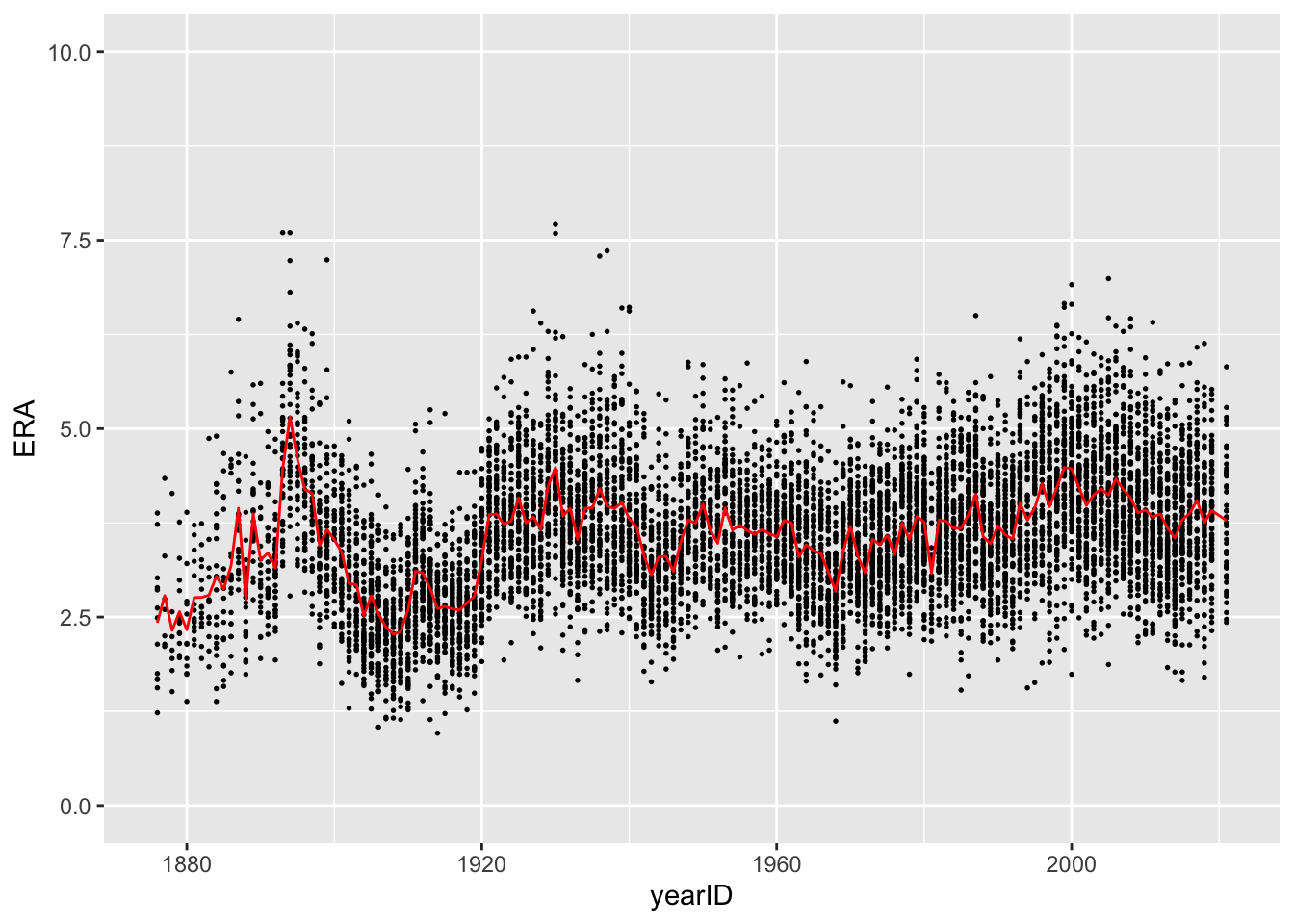
You’ll notice that the last line of code is a bit different than
anything we’ve seen before. In particular, we are specifying both the
data and mapping within the same ggplot2 function. If all of the
information we want to include in the plot is coming from the same data
source, it’s enough to just specify the data argument in
the first line, like we do with ggplot(data = pitching) and
not in every subsequent call to functions like geom_point
or geom_line. However, whenever we want to add layers to a
plot using data from another source (in this case, using data from
pitching_summary to plot the average ERAs), we need to tell
R explicitly and specify the data argument in
geom_line.