Lecture 4: Tidy Data & Regression Introduction
Tidy Data
Before we jump into any analysis, we wanted to start by discussing
the notion of “tidy data” because not all datasets you find will be
organized in a form that’s easy to analyze. Thus, you’ll often find
yourself in a situation where you’ll need to manipulate the data into a
better form. The entire tidyverse ecosystem of packages and
functions is based on analyzing datasets that are in a “tidy” format.
This format, at its simplest, must adhere to the following three
rules:
- Each variable must have its own column.
- Each observation must have its own row.
- Each value must have its own cell.
To make the above discussion much more concrete, let’s go back to the dataset we created in the challenge question at the end of Problem Set 3. If you haven’t yet completed that, you can download the final batting_2014_2015 dataset here (then save it to your “data” folder). Printing out the tbl, we see that there is a separate row for each “player-season”.
## # A tibble: 140 × 3
## # Groups:   yearID [2]
##    playerID  yearID    BA
##    <chr>      <int> <dbl>
##  1 abreujo02   2014 0.317
##  2 abreujo02   2015 0.290
##  3 altuvjo01   2014 0.341
##  4 altuvjo01   2015 0.313
##  5 andruel01   2014 0.263
##  6 andruel01   2015 0.258
##  7 aybarer01   2014 0.278
##  8 aybarer01   2015 0.270
##  9 bautijo02   2014 0.286
## 10 bautijo02   2015 0.250
## # ℹ 130 more rows
Let’s say we want to study the relationship between a player’s 2014
batting average and his 2015 batting average. In this case, each
observation is a player, and that player has two associated variables;
batting average in 2014, and batting average in 2015. We can do this
with the pivot_wider function. The names_from
argument indicates the new column(s) in the table - in this case
yearID. The values_from then indicates what
values go in our new columns - in this case BA. We can use
the names_prefix argument to easily rename the columns with
BA_ so that our columns don’t start with numbers.
batting_2014_2015 <- batting_2014_2015 %>%
  pivot_wider(
    names_from = yearID,
    values_from = BA,
    names_prefix = "BA_"
  )
head(batting_2014_2015)
## # A tibble: 6 × 3
## playerID BA_2014 BA_2015
## <chr> <dbl> <dbl>
## 1 abreujo02 0.317 0.290
## 2 altuvjo01 0.341 0.313
## 3 andruel01 0.263 0.258
## 4 aybarer01 0.278 0.270
## 5 bautijo02 0.286 0.250
## 6 beltrad01 0.324 0.287When we print out batting_2014_2015, we notice that it
is easier to read in this proper “tidy” format. Moreover, many of the
tidyverse functions that we’ve covered and will continue to
learn are much simpler to implement when used on data of this form.
We’ll continue to see examples of how to “tidy” up our data as we go
through the lectures and problem sets.
It can also be helpful to work with the original, “long” format of
the data when making visualizations. We can easily revert back to this
form with pivot longer, which will take the compact version and unpack
it back into one row per year. cols represents the column
titles that are instead being converted into a new column - in this case
BA_2014 and BA_2015. The names_to
argument indicates the name of the new column that will contain these
values, and the values_to argument indicates the name of
the new column that will contain the values themselves. We can then
mutate to remove the BA_ prefix and then see that our table
looks like our original data.
batting_2014_2015_long <- batting_2014_2015 %>%
  pivot_longer(
    cols = starts_with("BA_"),
    names_to = "yearID",
    values_to = "BA"
  ) %>%
  mutate(yearID = sub("BA_", "", yearID))

head(batting_2014_2015_long)
## # A tibble: 6 × 3
## playerID yearID BA
## <chr> <chr> <dbl>
## 1 abreujo02 2014 0.317
## 2 abreujo02 2015 0.290
## 3 altuvjo01 2014 0.341
## 4 altuvjo01 2015 0.313
## 5 andruel01 2014 0.263
## 6 andruel01 2015 0.258We can use this batting_2014_2015_long tbl to make a bar
plot with geom_col which shows the batting averages of each
player in 2014 and 2015.
batting_2014_2015_slice <- batting_2014_2015_long %>%
slice_head(n=20) #take the first 10 players alphabetically
ggplot(batting_2014_2015_slice, aes(x = playerID, y = BA, fill = yearID)) +
geom_col(position = "dodge", color = "black", alpha = 0.8) +
theme_minimal() +
theme(axis.text.x = element_text(angle = 45, hjust = 1))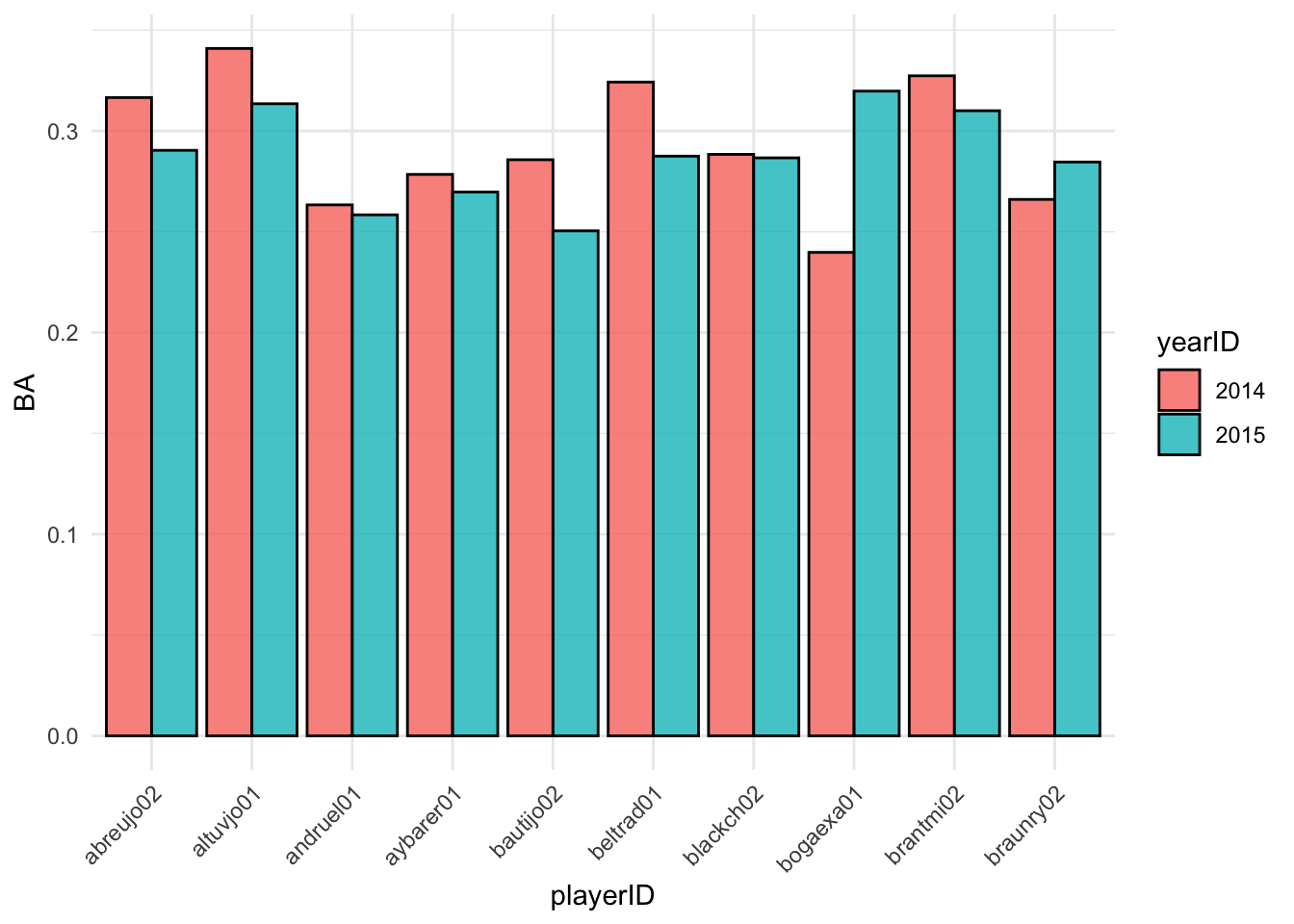 These visualizations can be helpful to compare player statistics. We can
now move back to using our cleaned, tidy data for predictions.
These visualizations can be helpful to compare player statistics. We can
now move back to using our cleaned, tidy data for predictions.
Predicting Batting Averages
Imagine there’s one more player who played in both 2014 and 2015 but who is not in our dataset. Without knowing anything else about the player, how could we predict their 2015 batting average using the data that we have? The simplest thing (and as it turns out the best thing) to do in this case is to use the overall mean of the 2015 batting averages in our dataset to predict the batting average of this extra player.
Now what if we also told you this extra player’s 2014 batting
average? Can we improve on this simple prediction? In this section, we
will propose several different ways of predicting 2015 batting average
using 2014 batting average. In order to pick the best one, we can assess
how well each method predicts the actual 2015 batting averages in our
tbl. We will add columns to our tbl containing these predictions. To get
things started, let’s add a column containing the overall mean of the
2015 batting averages. It turns out that this mean is 0.273, whereas the
mean 2014 batting average is 0.272. We will set these values equal to
the variables avg_2014, and avg_2015,
respectively, to use in our plots. We can do this by utilizing the
$ operator to feed an entire column into our
mean() function.
## # A tibble: 70 × 4
##    playerID  BA_2014 BA_2015 yhat_0
##    <chr>       <dbl>   <dbl>  <dbl>
##  1 abreujo02   0.317   0.290  0.273
##  2 altuvjo01   0.341   0.313  0.273
##  3 andruel01   0.263   0.258  0.273
##  4 aybarer01   0.278   0.270  0.273
##  5 bautijo02   0.286   0.250  0.273
##  6 beltrad01   0.324   0.287  0.273
##  7 blackch02   0.288   0.287  0.273
##  8 bogaexa01   0.240   0.320  0.273
##  9 brantmi02   0.327   0.310  0.273
## 10 braunry02   0.266   0.285  0.273
## # ℹ 60 more rowsIf the 2014 batting average had no predictive power at all, then this overall mean will be the best prediction model possible, given what data we have. Plotting the 2015 batting averages against the 2014 batting averages allows us to assess visually whether there is any relationship between the two variables. We have added dashed red horizontal and vertical lines at the overall means of the 2014 and 2015 data, respectively.
ggplot(batting_2014_2015) +
  geom_point(aes(x = BA_2014, y = BA_2015), col = 'black', size = 1) +
  geom_hline(yintercept = avg_2015, col = 'red', lty = 2) +
  geom_vline(xintercept = avg_2014, col = 'red', lty = 2)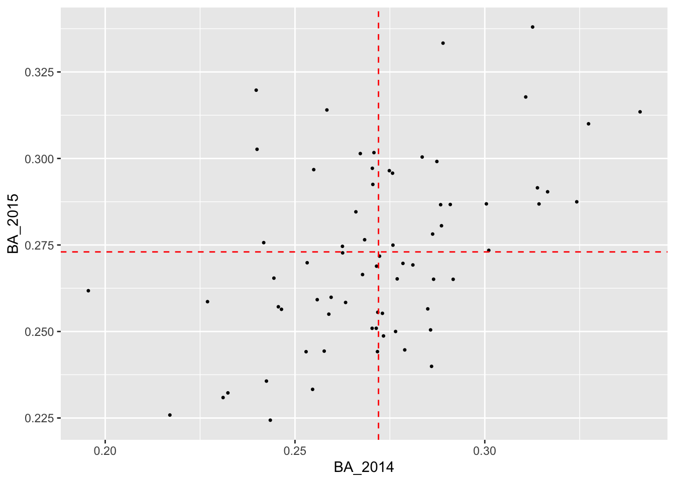
It certainly looks like there is a relationship! So it’s at least plausible that if we use the 2014 batting averages to make predictions for 2015, we can do better than relying on just the average of the 2015 averages.
Looking carefully at the plot, we see that most players with below average batting averages in 2014 tended to also have below average batting averages in 2015. Similarly, most players with above average batting averages in 2014 tended to have above average batting averages in 2015.
One way to improve on the simple prediction above would be as follows:
- Divide the players into two groups, one for those with above average BA in 2014 and one for those with below average BA in 2014.
- Average the 2015 BA within each of these groups and use these averages as the prediction for each member of the group.
In order to do this, we will need to mutate our tbl
batting_2014_2015 with a column indicating to which group
each player belongs. Then we can pass this column to
group_by() and compute the average BA_2015 within each
group. To create the column indicating group membership, we will use the
powerful cut() function, which divides the range of a
numerical vector into intervals and recodes the numerical values
according to which interval they fall.
The following code chunk does precisely that with two more steps: once we have made our predictions, we ungroup the tbl and we can drop the column indicating the interval in which our observation falls.
batting_2014_2015 <-
  batting_2014_2015 %>%
  mutate(bins = cut(BA_2014, breaks = c(0.15, 0.272, 0.40))) %>%
  group_by(bins) %>%
  mutate(yhat_1 = mean(BA_2015)) %>%
  ungroup() %>%
  select(-bins)
batting_2014_2015
## # A tibble: 70 × 5
## playerID BA_2014 BA_2015 yhat_0 yhat_1
## <chr> <dbl> <dbl> <dbl> <dbl>
## 1 abreujo02 0.317 0.290 0.273 0.281
## 2 altuvjo01 0.341 0.313 0.273 0.281
## 3 andruel01 0.263 0.258 0.273 0.265
## 4 aybarer01 0.278 0.270 0.273 0.281
## 5 bautijo02 0.286 0.250 0.273 0.281
## 6 beltrad01 0.324 0.287 0.273 0.281
## 7 blackch02 0.288 0.287 0.273 0.281
## 8 bogaexa01 0.240 0.320 0.273 0.265
## 9 brantmi02 0.327 0.310 0.273 0.281
## 10 braunry02 0.266 0.285 0.273 0.265
## # ℹ 60 more rowsWhen we run this code and print out our tbl, we see that there is a
new column called “yhat_1” that contains our new predictions. Before
proceeding, we should talk a bit about the syntax use in
cut(). The first argument is the variable we want to
discretize. The next argument, breaks = is a vector that
tells R where the endpoints of these intervals are. These are often
called “cut points” In this particular case, we wanted to divide the
players into those with below average batting averages in 2014 and above
average batting averages in 2015. The first element of the cut point
vector, 0.15 is much less than the smallest BA_2014 value, whereas the
second elements, 0.272, is the overall mean of the BA_2014 values. The
last element, 0.40 is much greater than the largest BA_2014 value.
Now that we have two different ways of predicting 2015 batting averages, let us see how they compare, visually.
ggplot(batting_2014_2015) +
  geom_point(aes(x = BA_2014, y = BA_2015), col = 'black', size = 2) +
  geom_point(aes(x = BA_2014, y = yhat_0), col = 'lightcoral', size = 2) +
  geom_point(aes(x = BA_2014, y = yhat_1), col = 'lightblue', size = 2)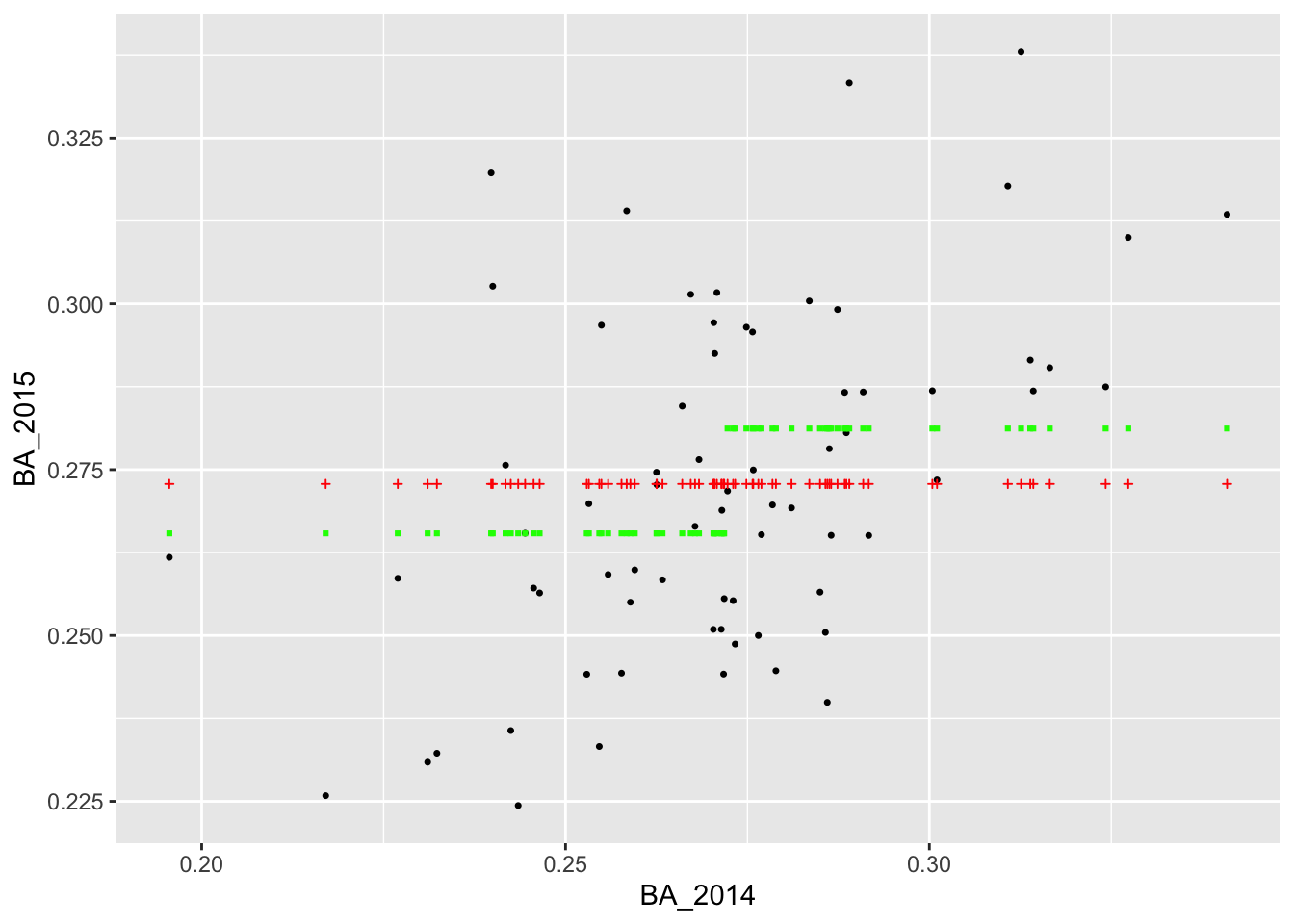
Visually it appears that the blue points (corresponding to yhat_1) are a bit closer to the actual values than the red points (corresponding to yhat_0). This would suggest that dividing the players into the two bins according to their 2014 batting average and using the average BA_2015 value within each bin as our forecast was better than using the overall average BA_2015 value for all players.
Of course, we can continue with this line of reasoning and divide the
players into even more bins. When we do that, instead of hand-coding the
vector of cut points, we can use the function seq() which
generates a vector of equally spaced numbers. To demonstrate, suppose we
wanted to divide the interval [0,1] into 10 equally sized intervals:
(0,0.1], (0.1, 0.2], …, (0.9, 1]. To get the vector of cutpoints, we
need to tell seq() either how many points we wanted or the
spacing between the points:
## [1] 0.0 0.1 0.2 0.3 0.4 0.5 0.6 0.7 0.8 0.9 1.0## [1] 0.0 0.1 0.2 0.3 0.4 0.5 0.6 0.7 0.8 0.9 1.0So let’s say we wanted to divide the 2014 batting averages into intervals of length 0.05 and predict 2015 batting averages using the average BA_2015 values within the resulting bins. We could run the following:
batting_2014_2015 <-
  batting_2014_2015 %>%
  mutate(bins = cut(BA_2014, breaks = seq(from = 0.15, to = 0.4, by = 0.05))) %>%
  group_by(bins) %>%
  mutate(yhat_2 = mean(BA_2015)) %>%
  ungroup() %>%
  select(-bins)
batting_2014_2015
## # A tibble: 70 × 6
## playerID BA_2014 BA_2015 yhat_0 yhat_1 yhat_2
## <chr> <dbl> <dbl> <dbl> <dbl> <dbl>
## 1 abreujo02 0.317 0.290 0.273 0.281 0.300
## 2 altuvjo01 0.341 0.313 0.273 0.281 0.300
## 3 andruel01 0.263 0.258 0.273 0.265 0.271
## 4 aybarer01 0.278 0.270 0.273 0.281 0.271
## 5 bautijo02 0.286 0.250 0.273 0.281 0.271
## 6 beltrad01 0.324 0.287 0.273 0.281 0.300
## 7 blackch02 0.288 0.287 0.273 0.281 0.271
## 8 bogaexa01 0.240 0.320 0.273 0.265 0.257
## 9 brantmi02 0.327 0.310 0.273 0.281 0.300
## 10 braunry02 0.266 0.285 0.273 0.265 0.271
## # ℹ 60 more rowsWe can also visualize our new predictions, this time with green points.
ggplot(batting_2014_2015) +
  geom_point(aes(x = BA_2014, y = BA_2015), size = 2) +
  geom_point(aes(x = BA_2014, y = yhat_0), col = 'lightcoral', size = 2, alpha = 0.8) +
  geom_point(aes(x = BA_2014, y = yhat_1), col = 'lightblue',  size = 2, alpha = 0.8) +
  geom_point(aes(x = BA_2014, y = yhat_2), col = 'darkseagreen3', size = 2, alpha = 0.8)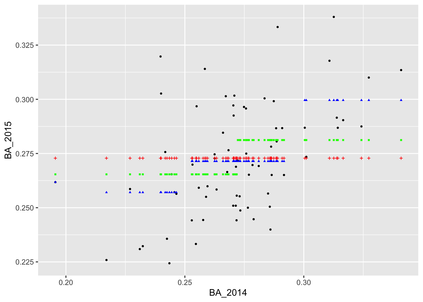
It appears that we are able to perfectly predict the 2015 batting average of the player with the lowest batting average in 2014. Why do you think this was the case?
Let’s add two more predictions in which we divide the 2014 batting averages into bins of length 0.005 and 0.001. The code below generates these predictions, saves them to columns called “yhat_3” and “yhat_4” in our tbl, and then adds the predictions to the plot in pink and orange.
batting_2014_2015 <-
batting_2014_2015 %>%
mutate(bins = cut(BA_2014, breaks = seq(from = 0.15, to = 0.4, by = 0.005))) %>%
group_by(bins) %>%
mutate(yhat_3 = mean(BA_2015)) %>%
ungroup() %>%
select(-bins)
batting_2014_2015 <-
batting_2014_2015 %>%
mutate(bins = cut(BA_2014, breaks = seq(from = 0.15, to = 0.4, by = 0.001))) %>%
group_by(bins) %>%
mutate(yhat_4 = mean(BA_2015)) %>%
ungroup() %>%
select(-bins)
ggplot(batting_2014_2015) +
geom_point(aes(x = BA_2014, y = BA_2015), size = 2) +
geom_point(aes(x = BA_2014, y = yhat_0), col = 'lightcoral', size = 2) +
geom_point(aes(x = BA_2014, y = yhat_1), col = 'lightblue', size = 2) +
geom_point(aes(x = BA_2014, y = yhat_2), col = 'darkseagreen3', size = 2) +
geom_point(aes(x = BA_2014, y = yhat_3), col = 'hotpink', size = 2) +
geom_point(aes(x = BA_2014, y = yhat_4), col = 'darkorange', size = 1.5, alpha = .7) 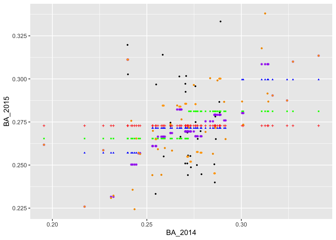 Here, we can see that some of the orange points are directly on top of
the actual values.
Here, we can see that some of the orange points are directly on top of
the actual values.
Assessing Predictive Performance
We now have a couple of different ways of predicting BA_2015. Qualitatively, the predictions in yellow (formed by binning BA_2014 into very small intervals) appear to fit the observed data better than the blue, green, and red predictions. To assess the predictions quantitatively, we often rely on the root mean square error or RMSE. This is the square root of the mean square error (MSE), which is computed by averaging the squared difference between the actual values and the predicted values.
reframe(batting_2014_2015,
          rmse_0 = sqrt(mean((BA_2015 - yhat_0)^2)),
          rmse_1 = sqrt(mean((BA_2015 - yhat_1)^2)),
          rmse_2 = sqrt(mean((BA_2015 - yhat_2)^2)),
          rmse_3 = sqrt(mean((BA_2015 - yhat_3)^2)),
          rmse_4 = sqrt(mean((BA_2015 - yhat_4)^2)))
## # A tibble: 1 × 5
## rmse_0 rmse_1 rmse_2 rmse_3 rmse_4
## <dbl> <dbl> <dbl> <dbl> <dbl>
## 1 0.0257 0.0244 0.0226 0.0185 0.0113We see that the the orange predictions have the lowest RMSE, followed by the purple, blue, green, and red predictions. This tells us that the predictions formed by binning into smaller intervals fit the data better than the predictions formed by binning into larger intervals, confirming what we could see visually.
Now, what if we continued this process, and formed bins that are infinitesimally small? Should we expect our predictions to be even better? However, think about the potential issues of doing so: most of the bins (an infinite number of them, in fact) would contain no data points. How could we remedy this issue? Perhaps, we could impose a constraint that our predictions must lie along a straight line, thus allowing the bins with data to help make predictions for the bins without data. You’ll have some time to think about this concept, and then in Lecture 6 we will introduce linear regression which addresses this exact issue.