Problem Set 4
Visualizing the Strike Zone
In this part, we will continue to use heatmaps (introduced briefly in Lecture 2) to explore the strike zone in baseball. We will focus on data collected by PITCHf/x. At a high-level, PITCHf/x consists of a set of cameras installed at every ballpark which tracks the motion of each pitch. For more information about the system, check out this article by Mike Fast The data collected by PITCHf/x is then transmitted to the MLB Gameday application along with contextual information about the pitch. The dataset we’ll be using contains the measurements from the PITCHf/x system recorded in 2015.
Download pitchfx_2015.csv to your “data” folder. Read the CSV file into a tbl called
pitchesusing theread_csvfunction.The columns are:
Description: Records the outcome of the pitch (Called Strike, Swinging Strike, Foul, etc.)XandZ: the horizontal and vertical coordinates of the pitch in inches. Note that the center of home plate corresponds toX = 0.- Note that the
Xcoordinate are recorded from the catcher’s perspective, with negative values on the left and positive values on the right. In this coordinate system, a right-handed batter will line up to the left (i.e. negativeXvalues).
- Note that the
COUNT: The ball-strike count for each pitchP_HANDandB_HAND: the handedness of the batter and pitcher.
To visualize the strike zone, we are going to want to filter out only the called strikes and balls. Moreover, it will be helpful to convert the Description to numeric values (1 for called strikes, 0 for balls). Use the pipe operator,
filter(),mutate(), andcase_when()to create a new tblcalled_pitchescontaining only the called strike and balls and that includes a new column “Call” whose value is 0 for balls and 1 for called strike.To get started, we will first initialize our plot. Since we are not telling it to plot anything, it will just be blank.

- To estimate the probability of a called strike given the pitch
location, we will use a strategy similar to what we used to make
heatmaps in Lecture 2. Essentially, we
divide the plane into several small rectangular bins and compute the
proportion of called strikes within each bin. To compute this, we use
the
stat_summary_2d()function, which takes three aesthetics:- x: variable on the horizontal axis
- y: variable on vertical axis
- z: variable that is passed to the summary function.
stat_summary_2d()divides the plane into rectangles based on the aesthetics x and y, and then computes the average value of z for observations in the bin. We can add this layer to our plot as follows and obtain the following plot.
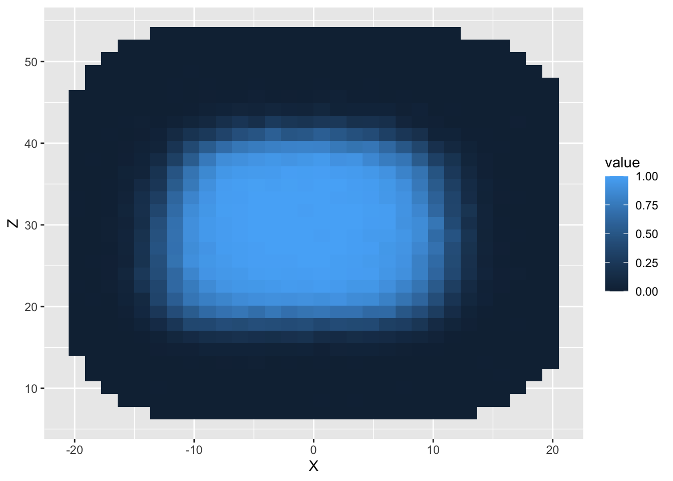
- You’ll notice in the plot above that
stat_summary_2d()has added a legend to our plot. However, the title of the legend is a somewhat non-informative. Moreover, the color scheme does not distinguish between different values particularly well. We can change both the title of the legend and the color scheme inside a function calledscale_fill_distiller. Don’t worry too much about what this function means for now; we will cover it in more depth in Lecture 5.
ggplot(data = called_pitches) +
stat_summary_2d(mapping = aes(x = X, y = Z, z = Call)) +
scale_fill_distiller("P(Called Strike)", palette = "RdBu")
- According to the official rule book, the strike zone is a
rectangular region that spans the width of home plate and extends
vertically from the batter’s knee to the middle of his chest. From the
plot above, we see that the region in which the strike zone probability
is higher than 90% is definitely not rectangular. To better visualize
the discrepancy, we can add another layer to plot which delimits an
approximation of the rule book strike zone. The code below does just
that. The
xminandxmaxarguments give the horizontal limits of the strike zone (in this case, the coordinates of the edges of the strike zone) and theyminandymaxarguments are the average vertical limits measured by PITCHf/x. Note: these values were pre-computed using a much larger dataset
ggplot(data = called_pitches) +
  stat_summary_2d(mapping = aes(x = X, y = Z, z = Call)) +
scale_fill_distiller("P(Called Strike)", palette = "RdBu") +
annotate("rect", xmin = -8.5, xmax = 8.5, ymin = 19, ymax = 41.5, alpha = 0, color = "black")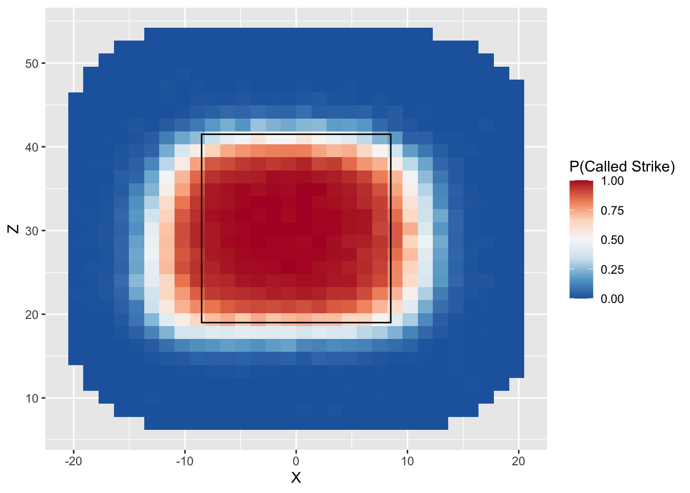
- We can additionally make the plot a bit more attractive visually by setting the theme to be minimal for a plain white background, removing the axis titles, and adding an overall title.
ggplot(data = called_pitches) +
  stat_summary_2d(mapping = aes(x = X, y = Z, z = Call)) +
  scale_fill_distiller("P(Called Strike)", palette = "RdBu") +
annotate("rect", xmin = -8.5, xmax = 8.5, ymin = 19, ymax = 41.5, alpha = 0, color = "black") +
theme_minimal() +
theme(axis.title.x = element_blank(),
axis.title.y = element_blank()) +
labs(title = "Estimated Strike Zone")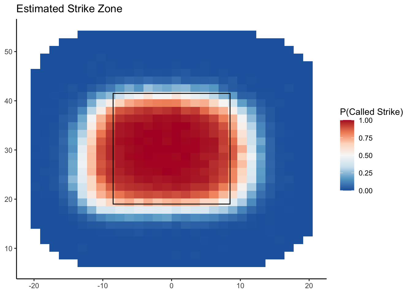
NBA Team Shooting Statistics
The file nba_boxscore.csv lists detailed box score information about every NBA player in every season ranging from 1996–97 season and 2015-16 season. We will look at team shooting statistics over this 20-season span.
- Download the nba_boxscore data above, save it in your data folder,
and add load it into a tbl called
raw_boxscore.
- The column “Tm” lists the team on which each player played. We can
look at the relative frequencies of the teams using the
table()function. This function takes a vector and returns the frequencies of each unique value.
## Tm
##  ATL  BOS  BRK  CHA  CHH  CHI  CHO  CLE  DAL  DEN  DET  GSW  HOU  IND  LAC  LAL  MEM  MIA  MIL  MIN
##  347  350   72  183  101  335   34  359  356  354  321  355  359  319  347  319  271  348  337  328
##  NJN  NOH  NOK  NOP  NYK  OKC  ORL  PHI  PHO  POR  SAC  SAS  SEA  TOR  TOT  UTA  VAN  WAS  WSB
## 298 161 34 63 345 144 340 352 348 338 332 342 195 366 1047 309 80 333 15- Looking at the list of teams you may see a few that you don’t
recognize. For instance, there are 15 players listed as playing on
“WSB”. We can use
filter()to take a closer look at these players.
## # A tibble: 15 × 22
##    Season Player Pos     Age Tm        G    GS    MP   FGM   FGA   TPM   TPA   FTM   FTA   ORB   DRB
##     <dbl> <chr>  <chr> <dbl> <chr> <dbl> <dbl> <dbl> <dbl> <dbl> <dbl> <dbl> <dbl> <dbl> <dbl> <dbl>
##  1   1997 Ashra… PF       25 WSB      31     0   144    12    40     1     1    15    28    19    33
##  2   1997 Calbe… SG       25 WSB      79    79  2411   369   730     4    30    95   137    70   198
##  3   1997 Matt … C        27 WSB       5     0     7     1     3     0     0     0     0     1     4
##  4   1997 Harve… PF       31 WSB      78    25  1604   129   314    28    89    30    39    63   193
##  5   1997 Juwan… SF       23 WSB      82    82  3324   638  1313     0     2   294   389   202   450
##  6   1997 Jaren… SG       29 WSB      75     0  1133   134   329    53   158    53    69    31   101
##  7   1997 Tim L… SG       30 WSB      15     0   182    15    48     8    29     6     7     0    21
##  8   1997 Gheor… C        25 WSB      73    69  1849   327   541     0     0   123   199   141   340
##  9   1997 Tracy… SF       25 WSB      82     1  1814   288   678   106   300   135   161    84   169
## 10   1997 Gaylo… SG       27 WSB       1     0     6     1     3     0     1     0     0     0     1
## 11   1997 Rod S… PG       30 WSB      82    81  2997   515  1105    13    77   367   497    95   240
## 12   1997 Ben W… PF       22 WSB      34     0   197    16    46     0     0     6    20    25    33
## 13   1997 Chris… PF       23 WSB      72    72  2806   604  1167    60   151   177   313   238   505
## 14   1997 Chris… PG       25 WSB      82     1  1117   139   330    58   163    94   113    13    91
## 15   1997 Loren… C        27 WSB      19     0   264    20    31     0     0     5     7    28    41
## # ℹ 6 more variables: AST <dbl>, STL <dbl>, BLK <dbl>, TOV <dbl>, PF <dbl>, PTS <dbl>
These fifteen players during the 1996-97 season on the Washington Bullets, which was renamed the Washington Wizards at the end of that season.There are a few other examples: VAN refers to the Vancouver Grizzlies who moved to Memphis and CHH refers to the original Charlotte Hornets franchise, which ultimately relocated to New Orleans.
One of the teams listed is “TOT”. This does not refer any specific team. Instead these rows record the total statistics recorded by a player if he played for multiple teams in a single season. For the purposes of understanding how team shooting statistics changed over time, we will not want to include these rows in our analysis.
Use
filter(),group_by(),reframe(), andmutate()to create a new tbl calledteam_boxscorethat does the following:- removes the rows corresponding to player totals
(i.e.
Tm == "TOT") - groups the tbl according to Season and Tm. Note: it is important to group on season first and team second
- Computes the total number of made and attempted field goals, three pointers, and free throws, along with points scored by each team in each season.
- Adds a column for team field goal percentage (FGP), three point percentage (TPP), and free throw percentages (FTP).
- Ungroup the resulting tbl
- removes the rows corresponding to player totals
(i.e.
Use
filter()to create a new tbl calledreduced_boxscorethat pulls out the rows ofteam_boxscorecorresponding to the following teams: BOS, CLE, DAL, DET, GSW, LAL, MIA, and SAS. Then create a line plot of these teams’ three point percentage in each season. Be sure to color the points according to the team (Hint: to map theTmvariable to the points as colors, use thecolor =argument within theaesfunction. We will learn more about this in Lecture 5). What patterns do you notice?Use
pivot_long()onreduced_boxscoreto create separate rows for each team’s FGP, TPP, and FTP. Create a tibble filtered on one team only and visualize how their FGP, TPP, and FTP have all evolved over time on one plot. *Challenge: usefacet_wrap()with teams on the entirereduced_boxscoretable to visualize the percentages for all 8 teams at once.
Work with new data
Once you finish reviewing the material from earlier this week, we’d like you to use some of the tools we introduced in Lecture 4 to read data into R.
Choose from some of the following datasets to take a look at:
Load in the one of the datasets and inspect their features with the
head()function.Try to make some visualizations with ggplot that explore the data. For example, plotting batting time through the order versus their event wOBA for the pitch. If you are working with the TTO data, try exploring something other than this for your problem set.
Next, try mutating your data with
reframe(), utilizingpivot(), or computing correlation withcor()to generate another visualization. For example, plotting the mean event wOBA withgeom_col().
ggplot(batting_tto_grouped, aes(x = ORDER_CT, y = mean_wOBA)) +
  geom_col(fill = "lightblue") +
  labs(title = "Mean Event wOBA by Batter Sequence",
       x = "Batter TTO",
       y = "Mean Event wOBA") +
  theme_minimal()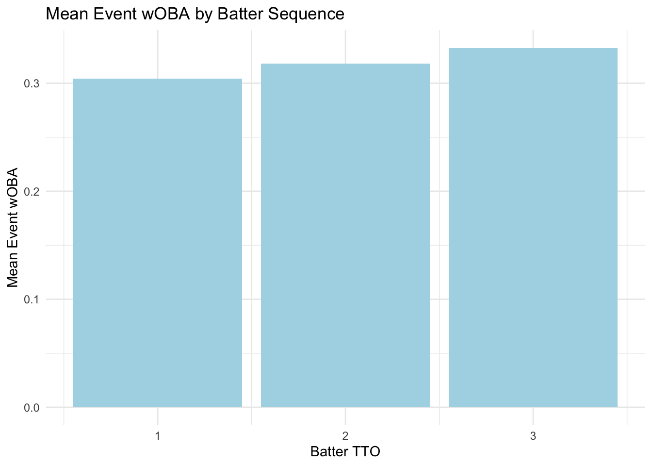
- Try computing some averages with
reframe()and test their predictive power on the dataset!