Problem Set 5
Data visualization with nflfastR
We will now apply our newly acquired plotting skills to make some visualizations working with data from nflfastR. Let’s load in our usual libraries, as well as nflfastR.
- Let’s load in the data for the 2024 season. This dataset contains play-by-play data for all games in the 2024 NFL season.
- We can see that there are more than 100 columns. Let’s tackle
specific questions one at a time. First, lets look at quarterback
completions by filtering for where
play_type == passand then selecting the following columns in a new table caledpbp_pass.
pbp_pass <- pbp_2024 %>%
  filter(play_type == "pass") %>%
  select(play_type, pass_location, yards_gained, air_yards, yards_after_catch,
         passer_player_name, complete_pass, incomplete_pass, cpoe)

head(pbp_pass)
## ── nflverse play by play data ──────────────────────────────────────────────────## ℹ Data updated: 2025-04-30 02:39:06 EDT## # A tibble: 6 × 9
## play_type pass_location yards_gained air_yards yards_after_catch
## <chr> <chr> <dbl> <dbl> <dbl>
## 1 pass left 22 -3 25
## 2 pass middle 9 2 7
## 3 pass middle 8 6 2
## 4 pass right 0 12 NA
## 5 pass <NA> 0 NA NA
## 6 pass left 5 5 0
## # ℹ 4 more variables: passer_player_name <chr>, complete_pass <dbl>,
## # incomplete_pass <dbl>, cpoe <dbl>nflfastR unfortunately doesn’t include a position field to identify quarterbacks. To workaround, this, groupby player and filter for players with >150 pass attempts to remove players without sufficient play time. Hint: pass attempts will be the sum of entries in complete_pass and incomplete_pass
Let’s take a preliminary look at how location might affect pass outcomes. First, use
!nawithfilter()to filter out pass attempts without a location label. Then, create a bar plot to visualize the frequency of attempts in each pass location. Feedpass_locationas a fill argument to make each bar a different color and make sure to uselabs()to set axis and plot titles. You should see that ggplot automatically adds a legend for you!Let’s look at the distribution of yards gained based on pass location with some box plots. Use
geom_boxplot()to create a box plot ofyards_gainedbypass_location. Continue using fill and labs to format the plots nicely.Completion yards over expected is a metric that adjusts for the difficulty of a QB’s throw by calculating the yards completed above the expected amount based on throw timing, coverage, and location. Take a look at how
cpoemay differ based on the pass location alone withgeom_violin()Discuss your plots for 4 and 5 with other students. What conclusions can you draw about the pass location and how it may affect pass outcomes?Let’s now turn to aggregated pass statistics per quarterback. Group by
passer_player_nameand create a table calledpbp_groupedwith columnspasser_player_name,attempts,avg_yards_gained, andavg_cpoeusingreframe().We can first visualize how attempts and avg_yards_gained are related by using a scatterplot. Let’s feed a color and size argument to
geom_point()to visually change the appearance of your plot and make the points take up an appropriate amount of space. Feel free to change the color argument to a color of your choice!
ggplot(pbp_grouped, aes(x = attempts, y = avg_yards_gained)) +
  geom_point(color = 'darkseagreen3', size = 3) +
  labs(
    title = "Quarterback Attempts vs Average Yards Gained",
    x = "Attempts",
    y = "Average Yards Gained"
  ) +
  theme_minimal()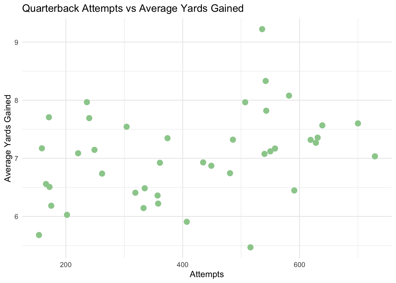
Next, add an abline to the plot using
geom_abline()to see how linear the data may be. Use theslopeandinterceptarguments to set the slope to 0.005 and the intercept to 5. Set the linetype to dashed, and the color to black. Note: This line was arbitrarily made with a slope and intercept that “looks best”, but in lecture 6, you will learn how to fit regression models to the data mathematically to make a line of best fit.Now, let’s add a third variable. Set the color to equal
avg_cpoeand usescale_color_viridis_c()to set the color scale.Finally, visualize the average yards gained and completion yards over expected by quarterback. Choose to arrange either by
avg_yards_gainedoravg_cpoeand obtain the top 10 quarterbacks for this metric. Pivot long to create a table similar to the one shown in lecutre 4, where each QB has a row for their average yards gained and average cpoe, then generate a bar plot withgeom_col(). Make sure to usedodgeand to either use 45 degree axis labels or flip the coordinates withcoord_flip()so that the QB names are visible.
What have you learned from these graphs? How do quarterbacks differ in their average yards gained vs average completion yards over expected? Is Lamar the GOAT??
Let’s do one more small case study on explosive plays.
- First, start by filtering the data as below to get the appropriate columns.
pbp_explosive <- pbp_2024 %>%
  filter(play_type %in% c("pass", "run"),
         !is.na(yards_gained),
         !is.na(defteam),
         !is.na(down),
         !is.na(yardline_100)) %>%
  mutate(
    explosive = case_when(
      play_type == "run"  & yards_gained >= 10 ~ 1,
      play_type == "pass" & yards_gained >= 20 ~ 1,
      TRUE ~ 0
    )
  ) %>%
  filter(explosive == 1) %>%
  select(
    game_id,
    play_id,
    defteam,          # defensive team
    play_type,        # pass or run
    ydstogo,          # yards to go for first down
    yardline_100,     # field position (how far from opponent's end zone)
    yards_gained,     # actual yards gained on play
    explosive         # your new indicator (1 or 0)
  )

head(pbp_explosive)
## ── nflverse play by play data ──────────────────────────────────────────────────## ℹ Data updated: 2025-04-30 02:39:06 EDT## # A tibble: 6 × 8
## game_id play_id defteam play_type ydstogo yardline_100 yards_gained explosive
## <chr> <dbl> <chr> <chr> <dbl> <dbl> <dbl> <dbl>
## 1 2024_01… 83 BUF pass 7 67 22 1
## 2 2024_01… 622 BUF pass 4 65 24 1
## 3 2024_01… 707 BUF run 10 28 11 1
## 4 2024_01… 902 ARI run 10 64 15 1
## 5 2024_01… 946 ARI pass 5 44 23 1
## 6 2024_01… 1269 BUF run 6 56 12 1Let’s visualize the distribution of explosive plays by defensive team. Use
geom_bar()to create a bar plot of the number of explosive plays bydefteam. Usefill = defteamto color the bars by team and uselabs()to set the axis and plot titles.Let’s take a closer look at the worst defenses against explosive plays. Group by defensive team and play type, then use reframe to obtain the number of explosive plays in each category, and
slice_max()to obtain the top 10 teams. Replot the bar graphs and facet by pass or run plays. Hint: to create a column counting the number of rows, usen()withreframe(). Additionally, usescales = 'free'withfacet_wrap()to allow each facet to have its own y-axis scale.Challenge: Finally, let’s visualize the relationship between explosive plays and yards to go with a heat map. First, run the following code below to obtain the needed columns for this plot.
pbp_explosive_rate <- pbp_2024 %>%
  filter(play_type %in% c("pass", "run"),
         !is.na(yards_gained),
         !is.na(defteam),
         !is.na(down),
         !is.na(yardline_100)) %>%
  mutate(
    explosive = case_when(
      play_type == "run"  & yards_gained >= 10 ~ 1,
      play_type == "pass" & yards_gained >= 20 ~ 1,
      TRUE ~ 0
    )
  ) %>%
  select(
    game_id,
    play_id,
    defteam,          # defensive team
    play_type,        # pass or run
    ydstogo,          # yards to go for first down
    yardline_100,     # field position (how far from opponent's end zone)
    yards_gained,     # actual yards gained on play
    explosive         # your new indicator (1 or 0)
  )
Then, group by defteam and ydstogo and
obtain the explosive play rate, instead of number of explosive
plays. Hint: You will need to use n() and
sum() for this task. Then, use
geom_tile() to create a heat map with defteam
on the x-axis, ydstogo on the y-axis, and fill based on the
number of explosive plays. Set a color gradient to your liking.
Discuss with fellow students possible conclusions that can be drawn from the visualizations in this section. How are teams’ defenses stacking up against explosive plays? How much should certain bins in this visualization be weighed over others?